Using Fabric on Your Cards and Layouts

Hi there! If you’ve jumped over here from the Practical Scrappers blog then Welcome! I’m so happy to see you!! Today I am talking about using fabric on your projects and I’m sharing a number of ways in which I have done just that recently.

Fabric is a pretty hot trend in the paper crafting world right now and there are many types of fabric you can add to your cards and layouts. Some have been around for ages – think ribbon and lace – and some are fairly new – fabric paper for example. Today I want to show you how to take ordinary pieces of cotton fabric and transform them!

First let’s make some embellishments out of fabric like I did here on these two cards.

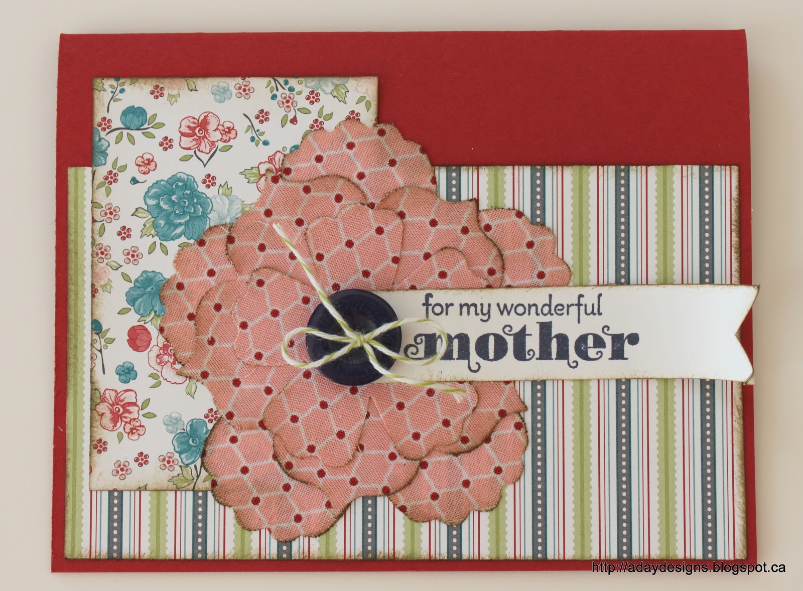
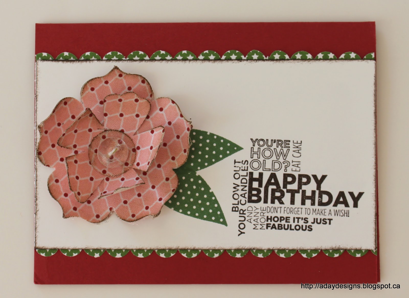
Both these flowers were made using a piece of cotton fabric and a sheet of Multipurpose Adhesive for the Big Shot. Let me show you how I made them.

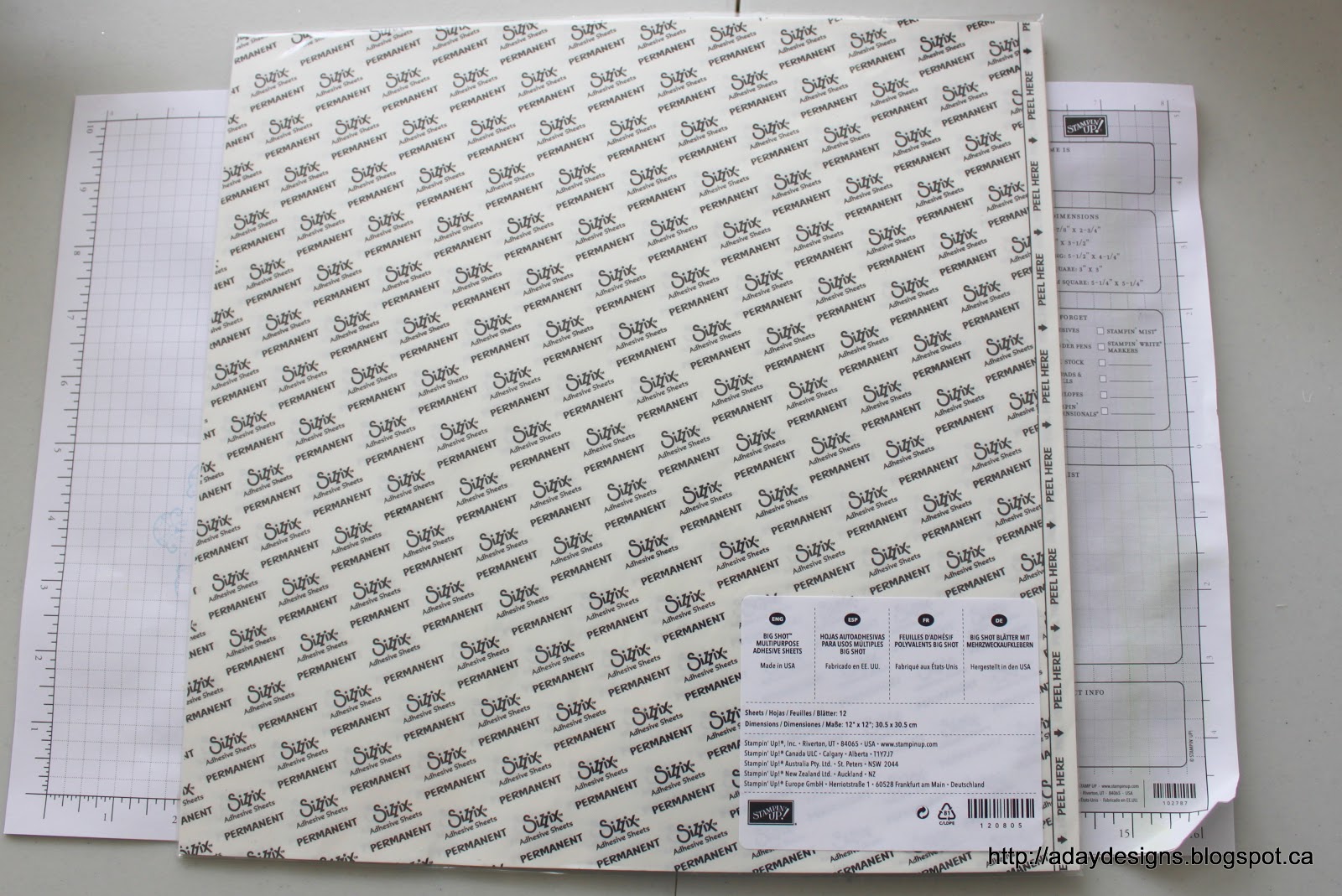
1. This is the Big Shot Multipurpose Adhesive Sheet as sold by Stampin’ Up (see below for links). It comes 12 sheets to a pack and each sheet is 12″x12″ so you can make TONS of projects from one pack. And they’re not just for fabric, that’s just what I’m showing you today. In fact, Stampin’ Up also sells adhesive rolls specifically for fabric but since the Multipurpose sheets are great for paper too, I think they are a better deal for layout makers like myself.
2. Lay your fabric on your work surface face down (TIP: iron it first!! learned the hard way that those creases don’t magically come out when you lay the adhesive sheet on top of them!) Peel off one corner of the adhesive sheet, turn it over and stick it down onto your fabric.

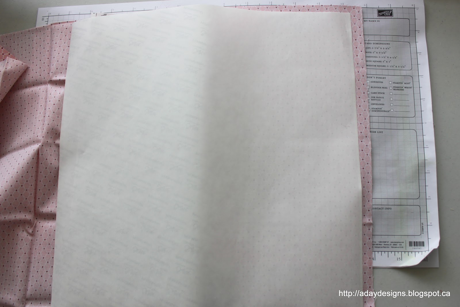
3. Slowly pull back the rest of the adhesive backing using a bone folder to keep it as straight and crease free as possible until the entire 12″x12″ sheet is adhered to your fabric.

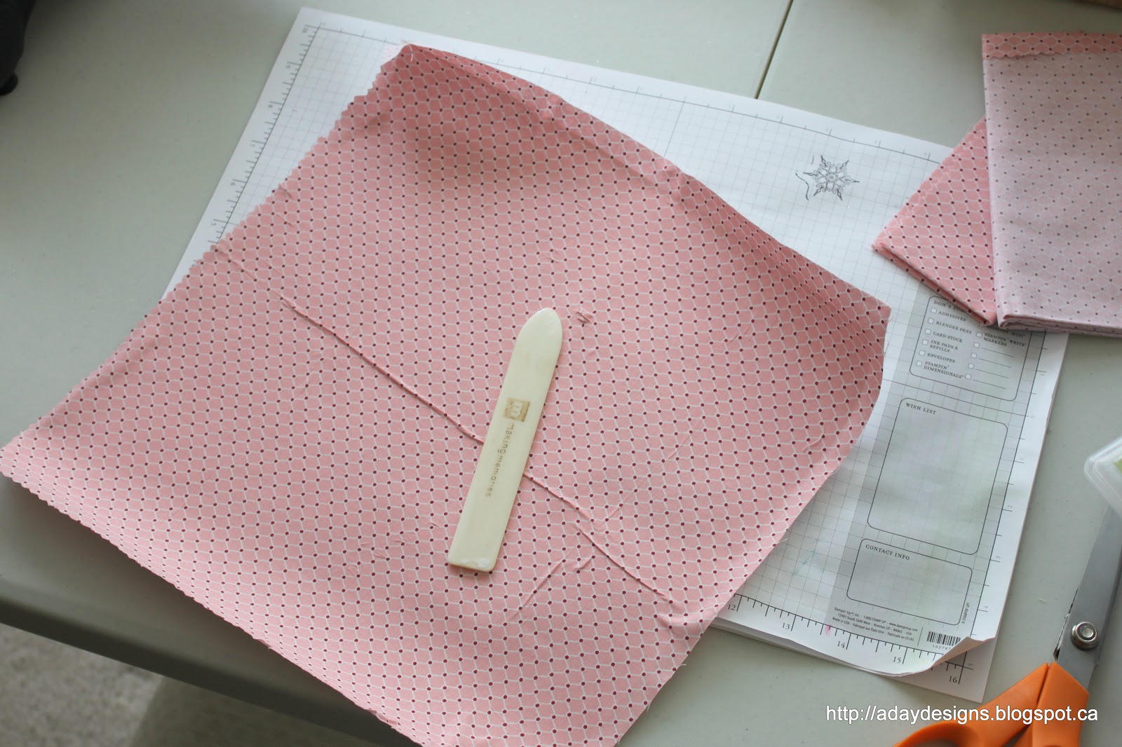
4. Trim off the excess and then use your bone folder again (or a credit card or ruler if you don’t have a bone folder) to get out any remaining creases or air bubbles. And no, I was not able to get out that huge crease but as I was cutting the sheet in half to fit through my Big Shot I decided not to worry about it. Remember, IRON FIRST!

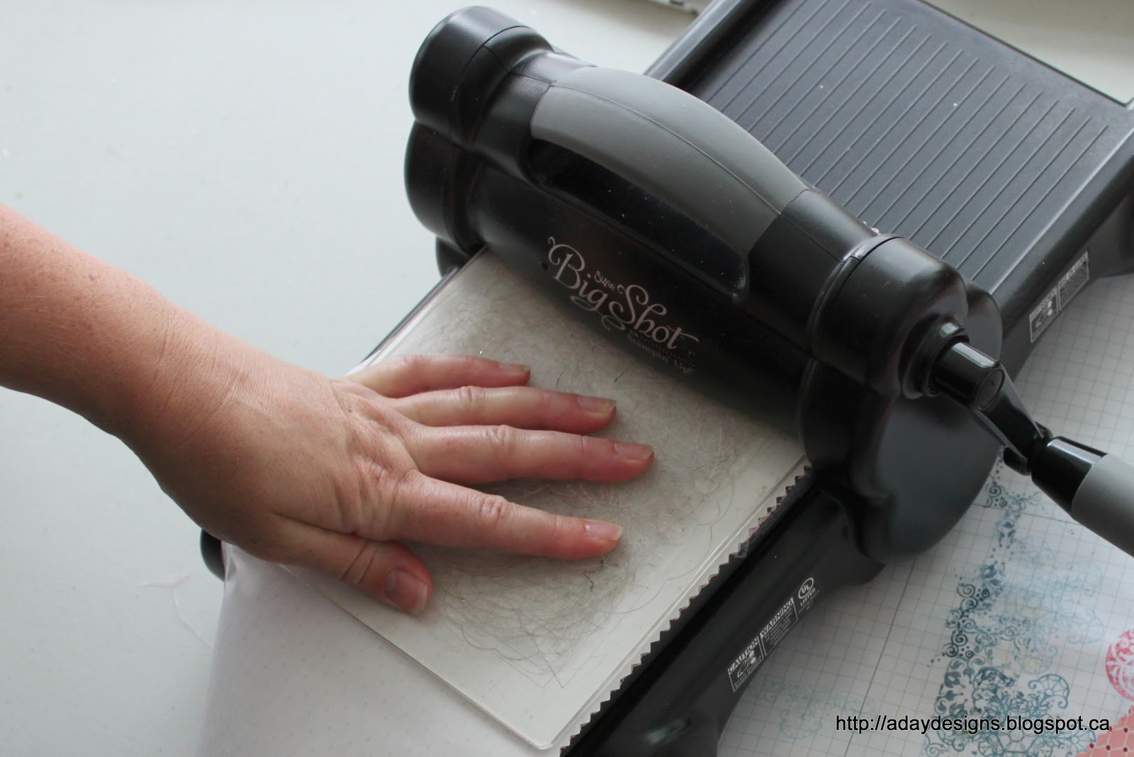
5. Cut your sheet to fit your Big Shot die – I used the Fun Flowers Bigz L die so a simple cut in half sufficed. If your die is smaller you may want to cut your sheet smaller to minimize waste. Make your Big Shot sandwich (cutting mat – Die – fabric – cutting mat) and run everything through your Big Shot (or other manual cutting system – whatever you have.) 

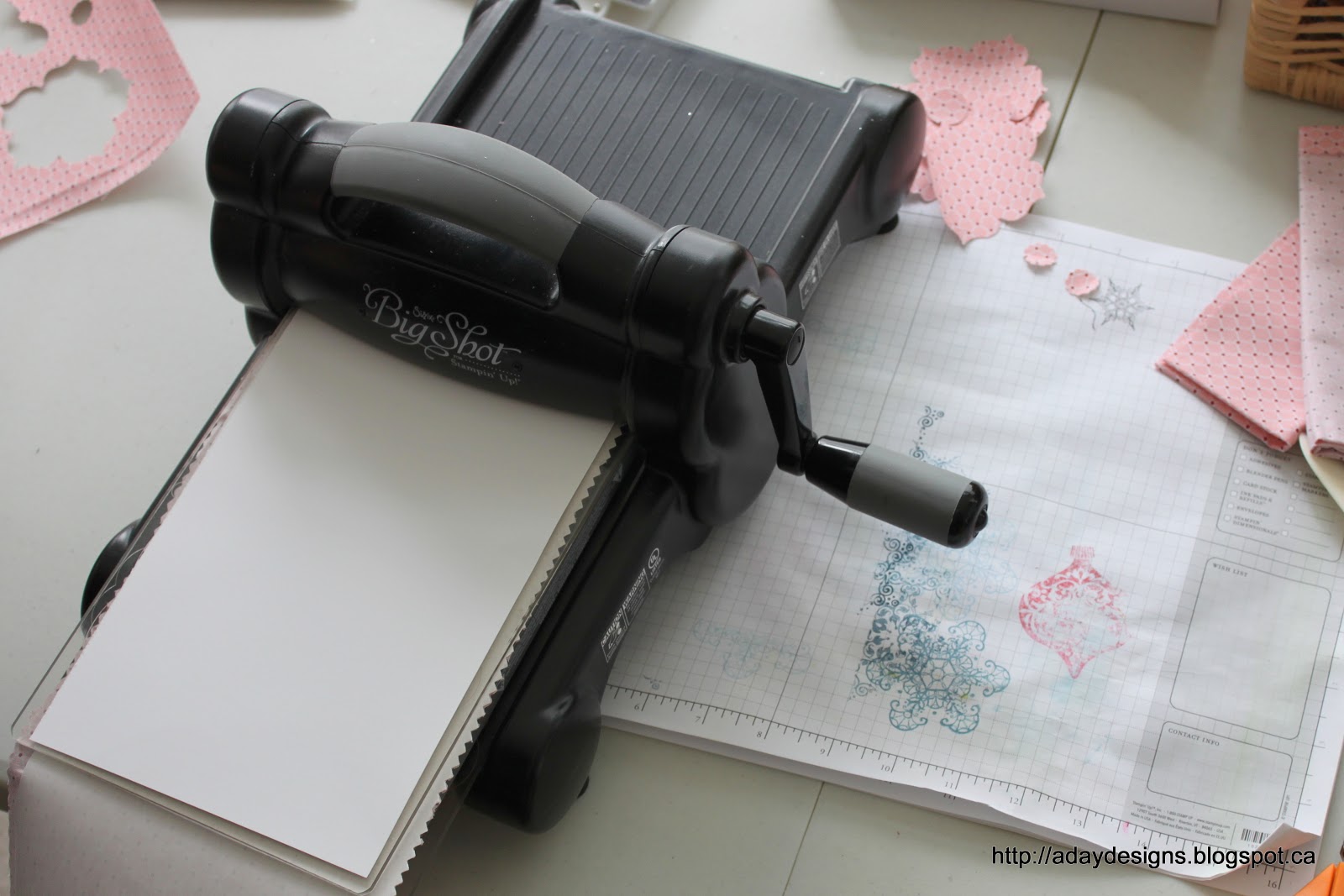
5b. I found that some of my flowers didn’t cut completely through, so when I ran my second piece of fabric through I used a scrap piece of card stock as a shim and the flowers cut out perfectly. In this picture you see the white card stock shim on top of the Big Shot sandwich – this is very important. If you put it under the top cutting mat you will just end up cutting out white card stock flowers as well as fabric ones. Maybe that’s what you want … maybe it’s not!

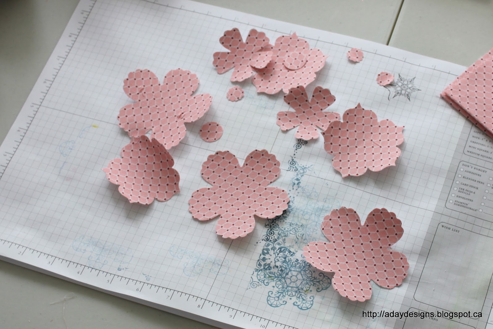
6. Sit back admire your beautiful fabric flowers! 🙂 I cut out two full sets plus a couple extra of the larger flowers to have on hand.

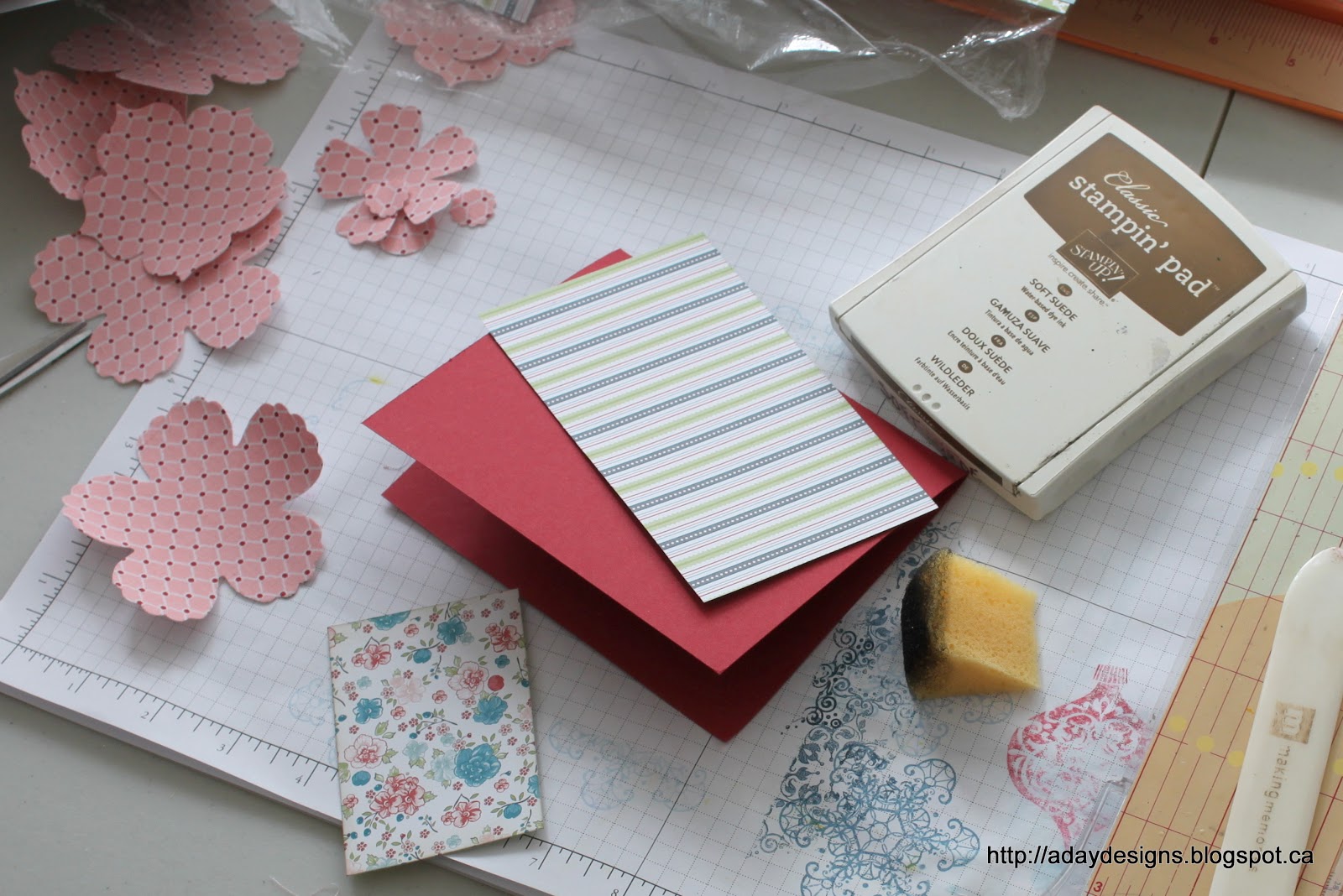
7. Time to assemble your card. Obviously, you would use whatever papers coordinated with your fabric, I am lucky enough to get to work with Stampin’ Up papers and fabrics which are already pre-coordinated. So here I am showing you a piece of Riding Hood Red card stock (5.5″ x 4.25″ folded in half) and two pieces of the Twitterpated Designer Series paper which coordinate with that pink Twitterpated Designer Fabric.

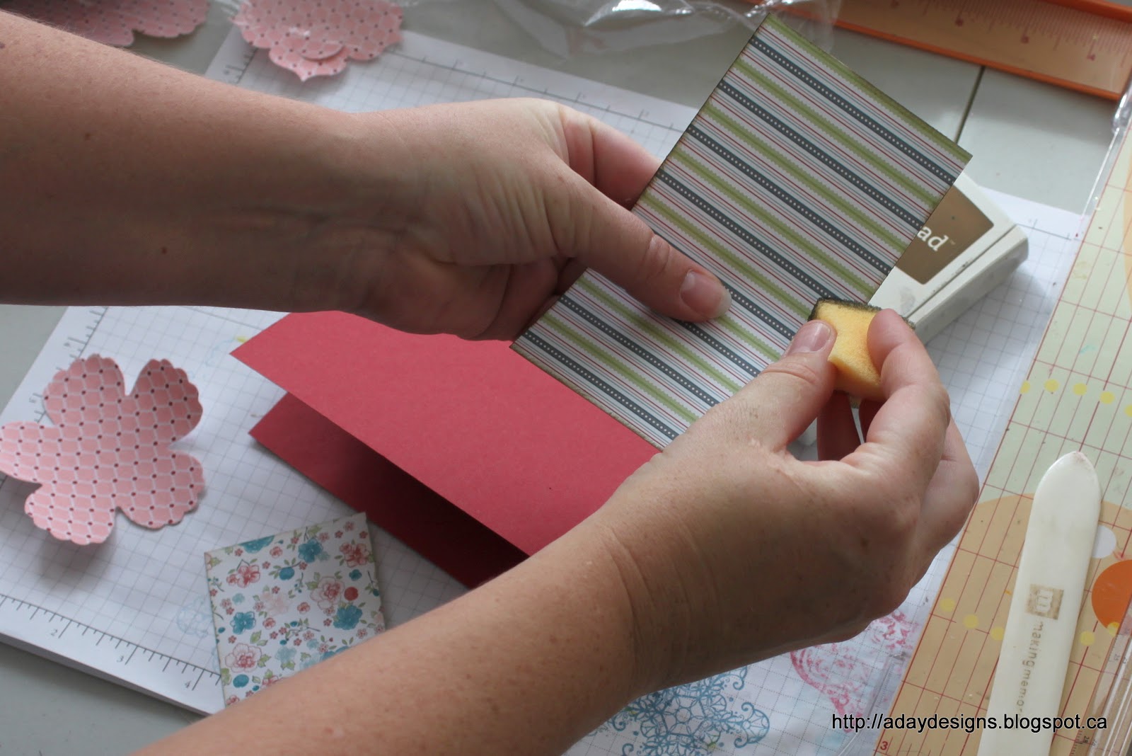
8. I love to ink my edges. I find it gives added definition and “finish” to my projects. Here I am showing you how I do that using a Stamping Sponge that I’ve simply cut into a wedge shape. I am using Soft Suede ink – my favourite colour for inked edges!

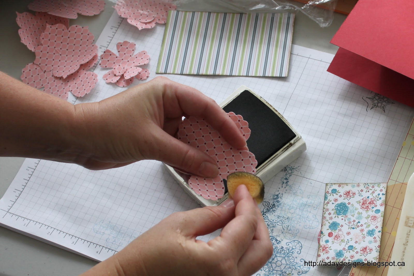
9. Don’t forget about your fabric flowers. They gain a lot by having their edges inked too!

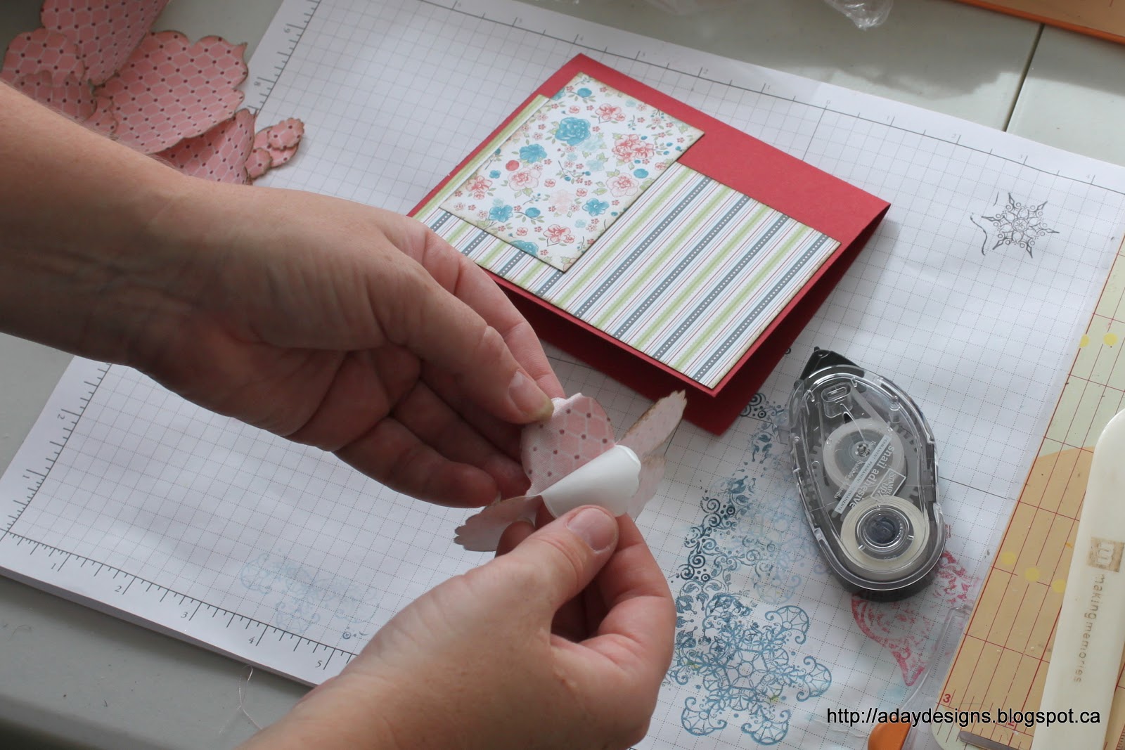
10. For our first card I simply adhered my paper pieces as shown using my Snail Adhesive runner. Then it was time to start building my fabric flower embellishment. Carefully peel the backing from the largest die cut flower and adhere it to the card as shown below.

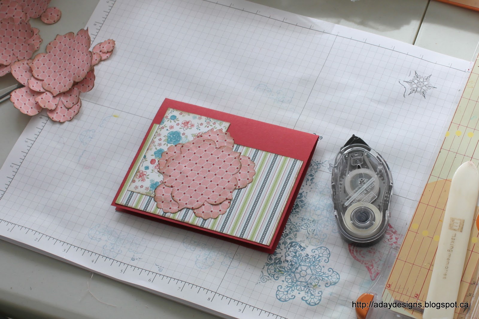
11. Continue this with the smaller flowers laying them down in a offset pattern being sure to keep them centred.

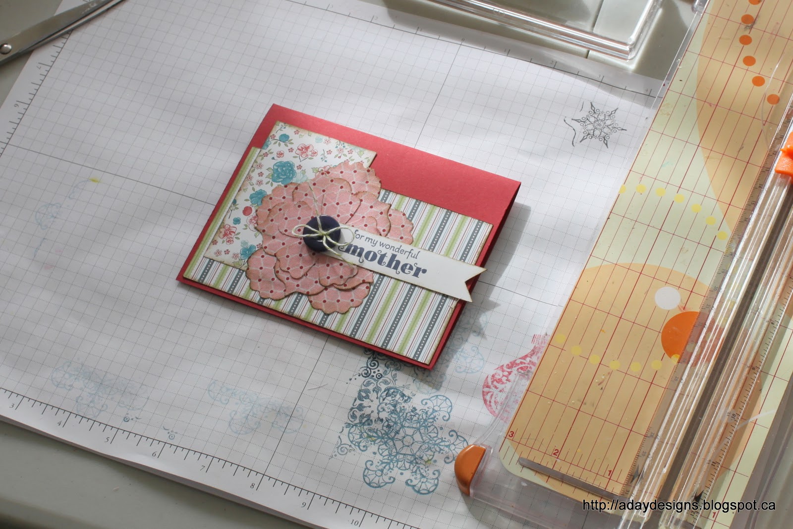
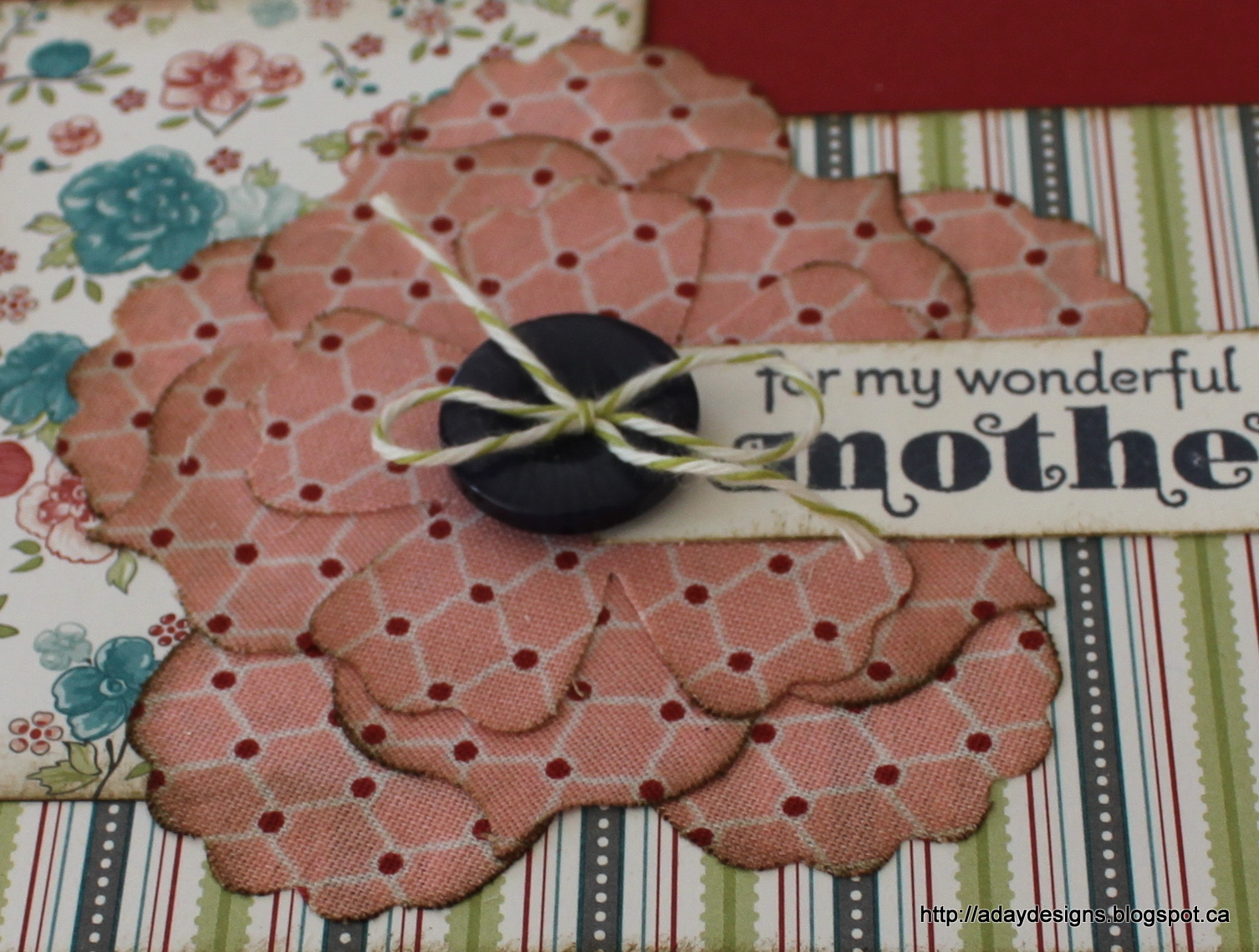
12. Finishing touches. I finished my card off with a button tied with some bakers twine and a sentiment stamped onto a piece of Whisper White card stock. Here is a close up of the finished flower.
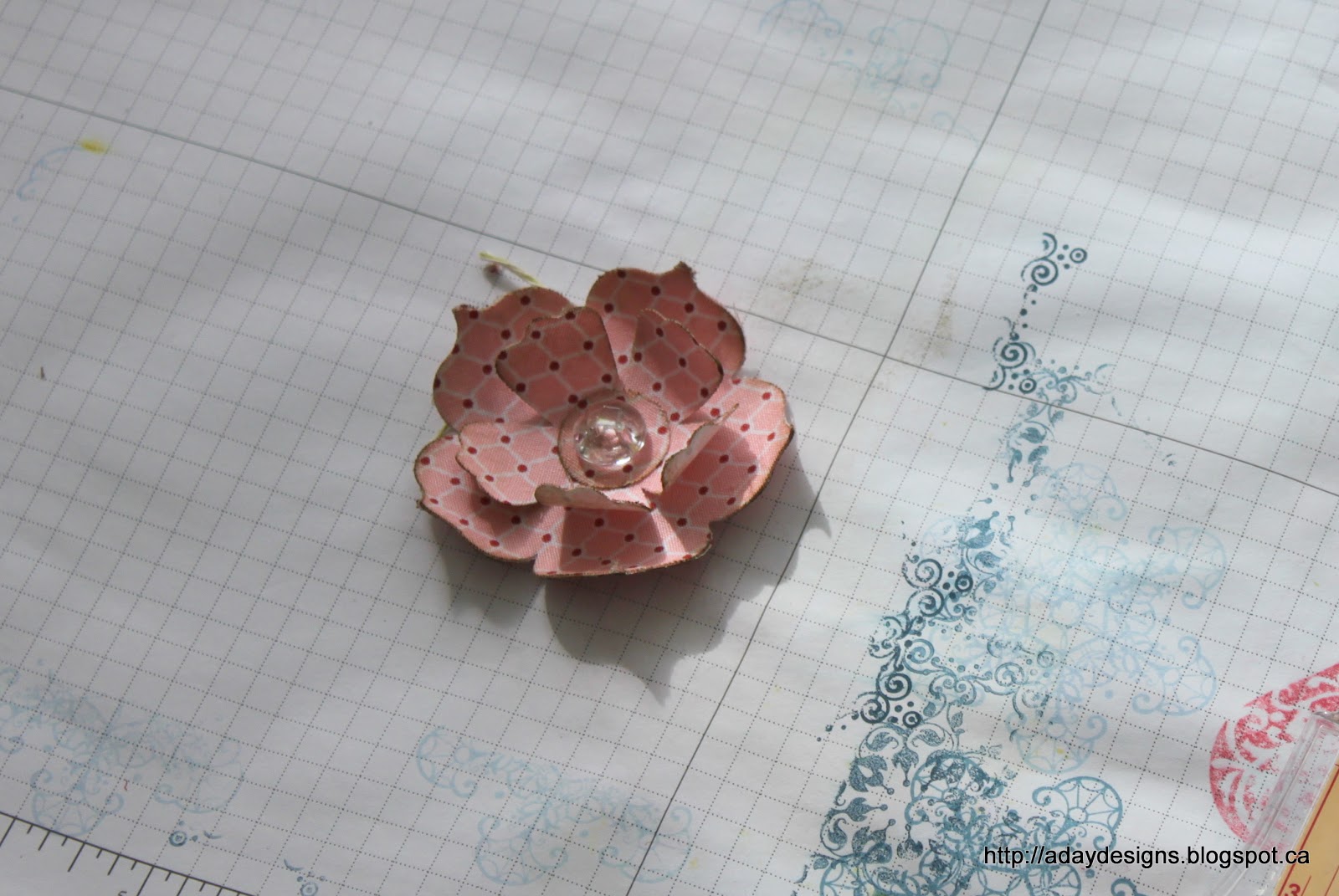
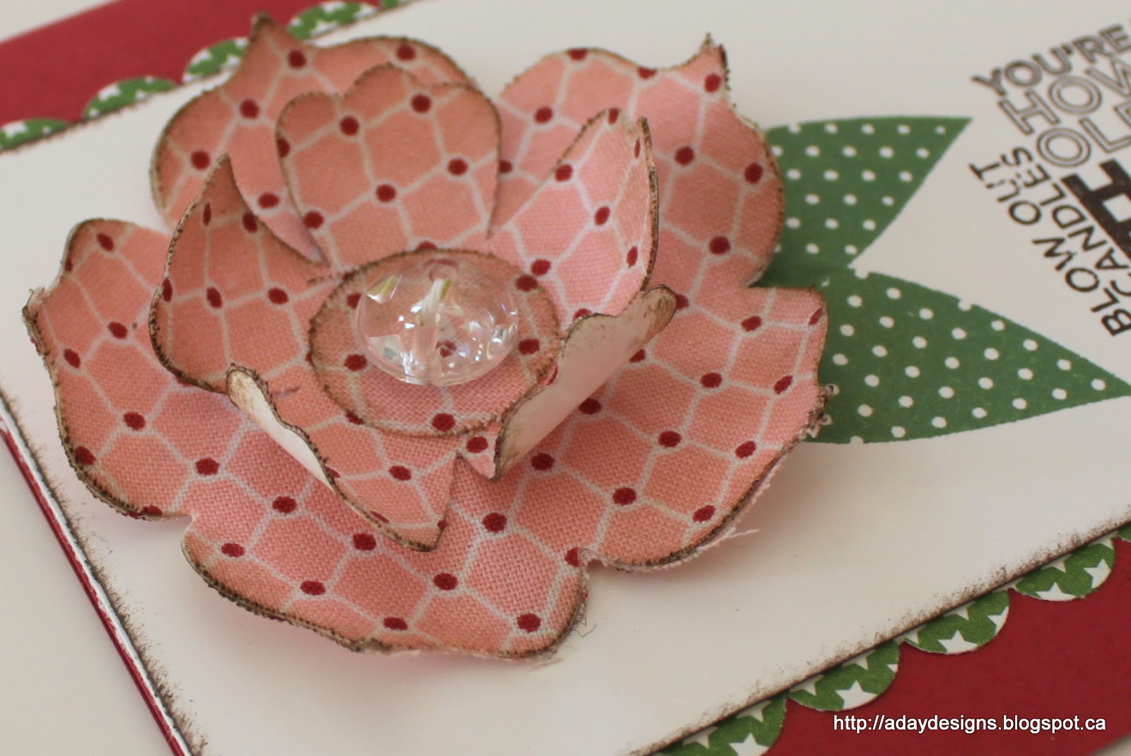
13. For a more 3-dimensional flower like this one, I simply left the backings on each flower layer and used my bone folder to curl them after they were adhered together. With the addition of a Vintage Faceted Button, it looks like this on the finished card.
Well, that’s one way to use fabric on your cards and layouts … are you still with me? Want another way?
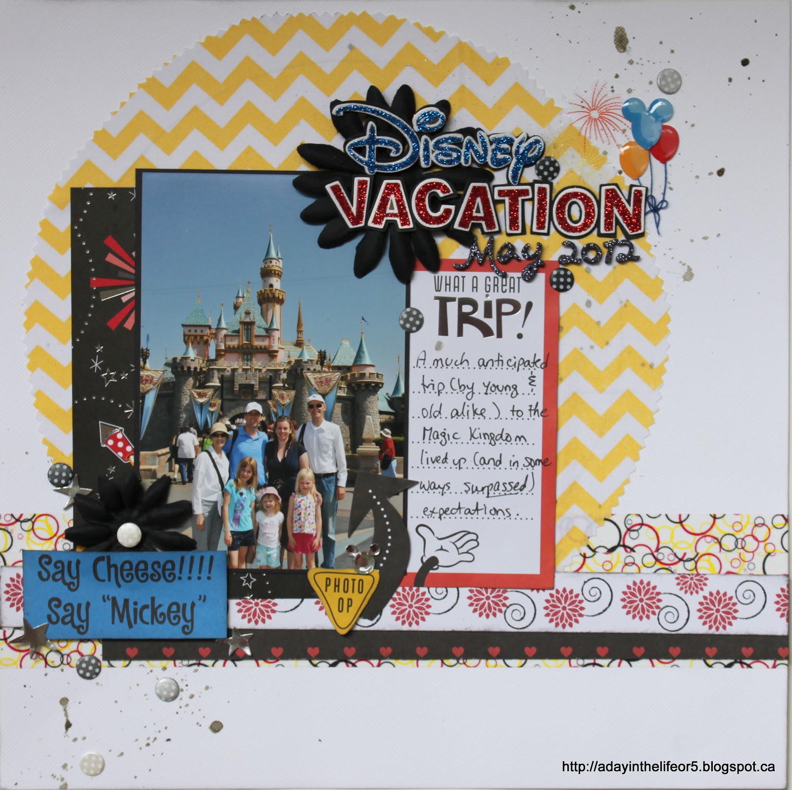
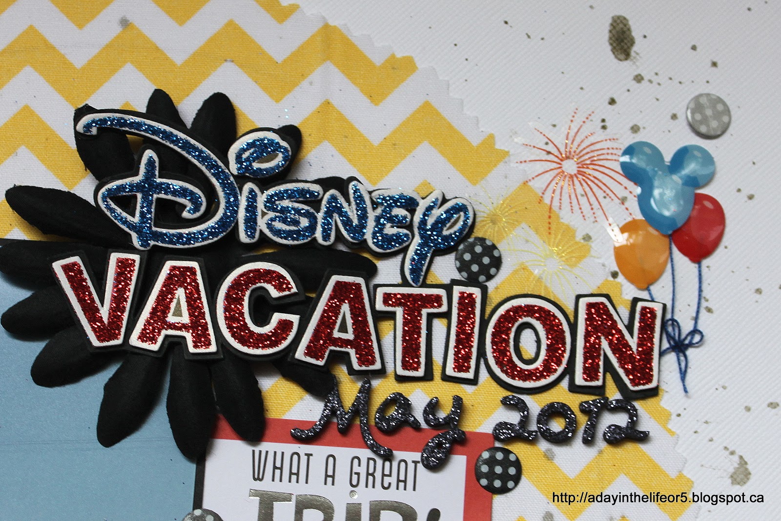
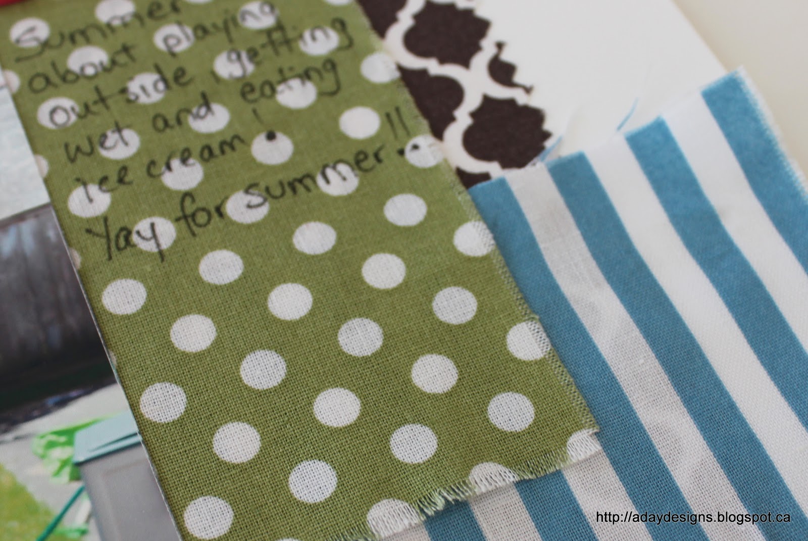
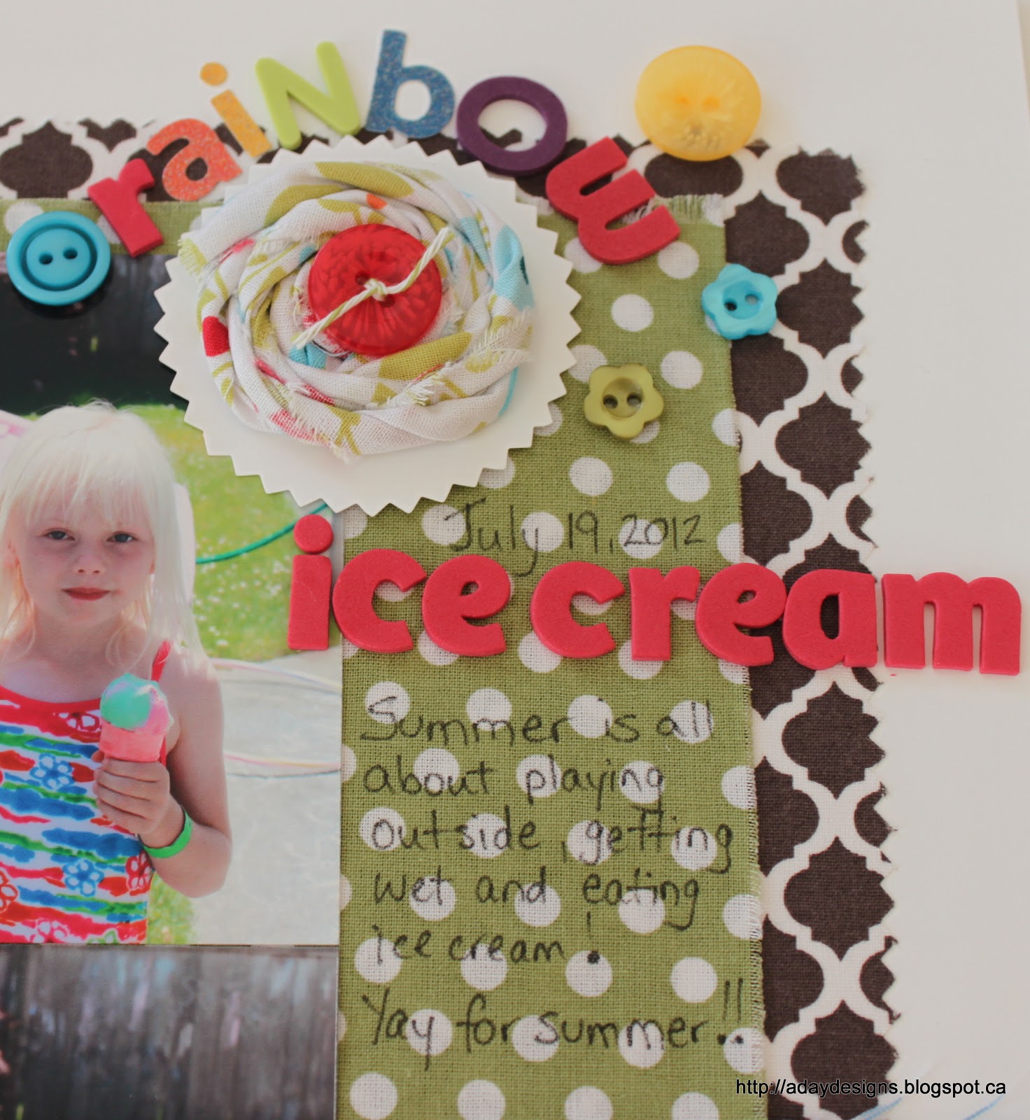
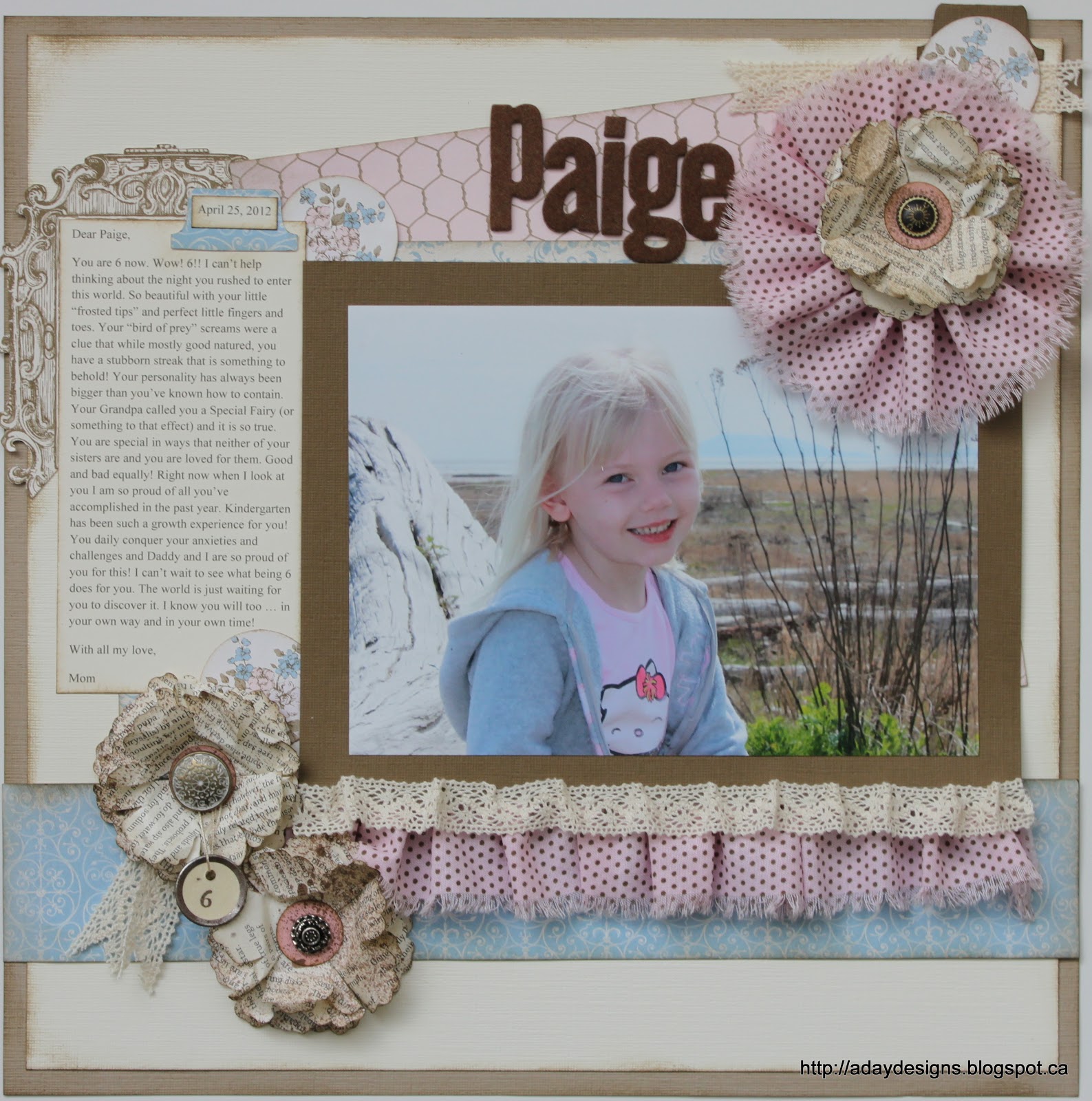
How about using it in place of paper? That’s right, you heard me. Instead of pieces of patterned paper on this layout, I used pieces of fabric.
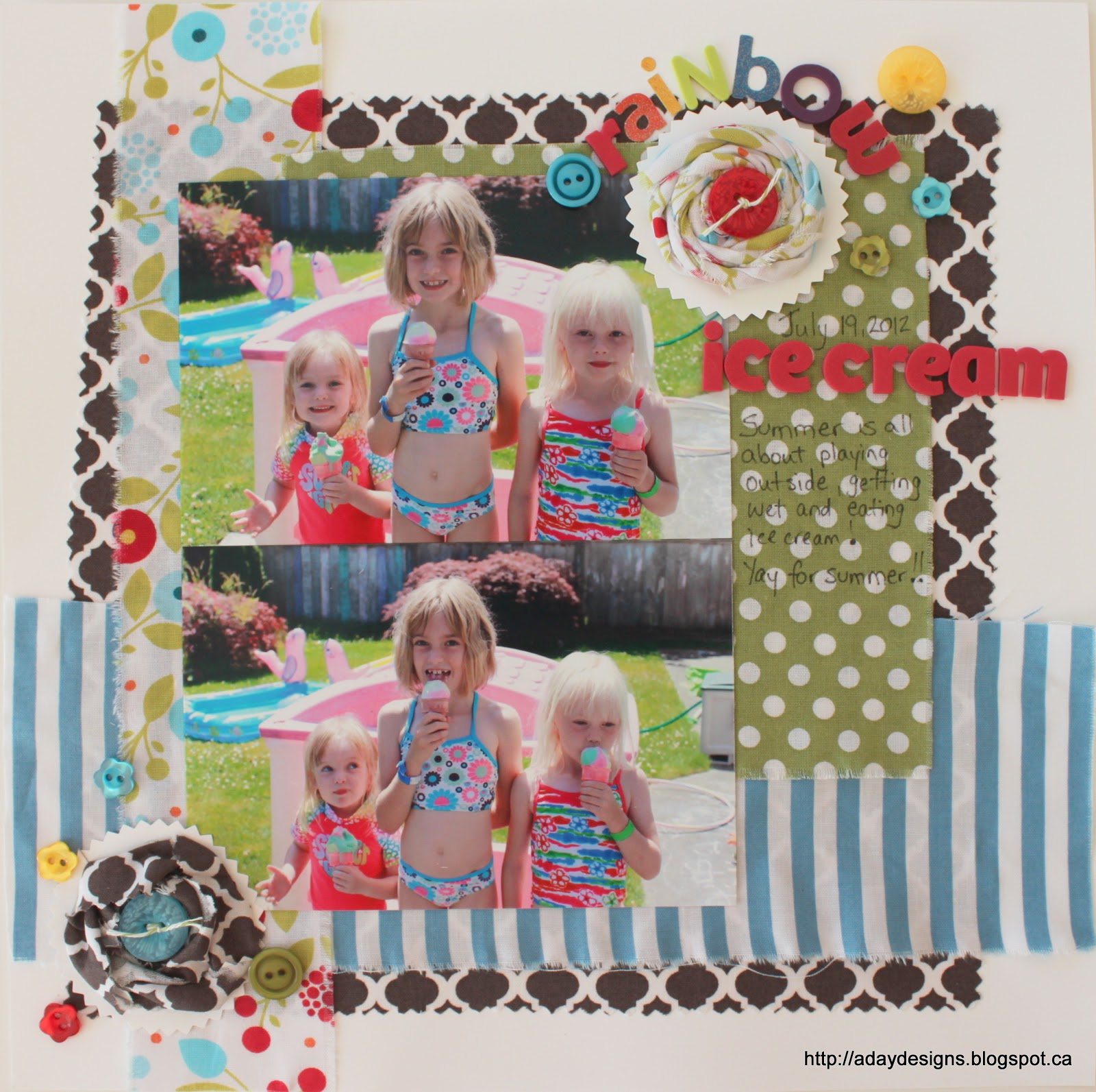
There are literally 3 pieces of paper on this whole layout (okay, 5 if you count the photos!) – the background card stock and the two pinked circles under the rolled fabric flowers. Everything else is fabric!
The large square of brown fabric was adhered using another Multipurpose Adhesive Sheet and the smaller pieces were adhered using Sticky Tape. (If I had a functional sewing machine I would have sewn them to the card stock but … I don’t, so tape and glue are my friends!)

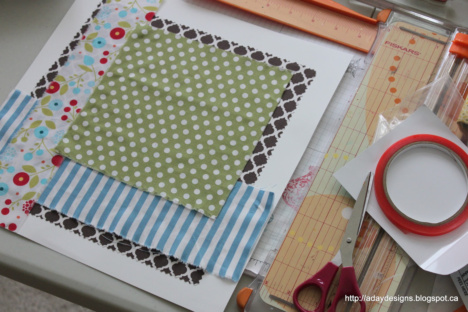
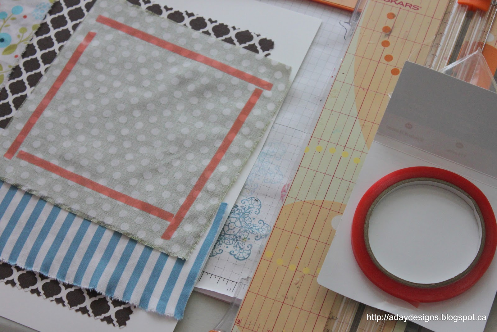
This is what my layout’s starting point looked like.
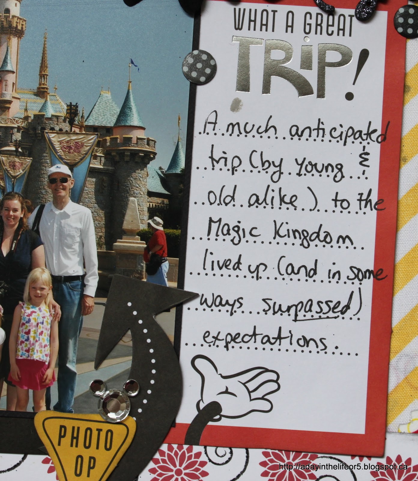
Here a close up of the layers of fabric. Oh yeah, I also wrote my journaling right onto the fabric! Easy peasy!!
And now for my third way to use fabric on a layout or card – make a rolled flower embellishment like this one.

Here’s how I did it.

1. Start with a giant glue dot – take off the top layer of plastic to expose the glue.

2. Twist your fabric and place one end in the middle of the glue dot.

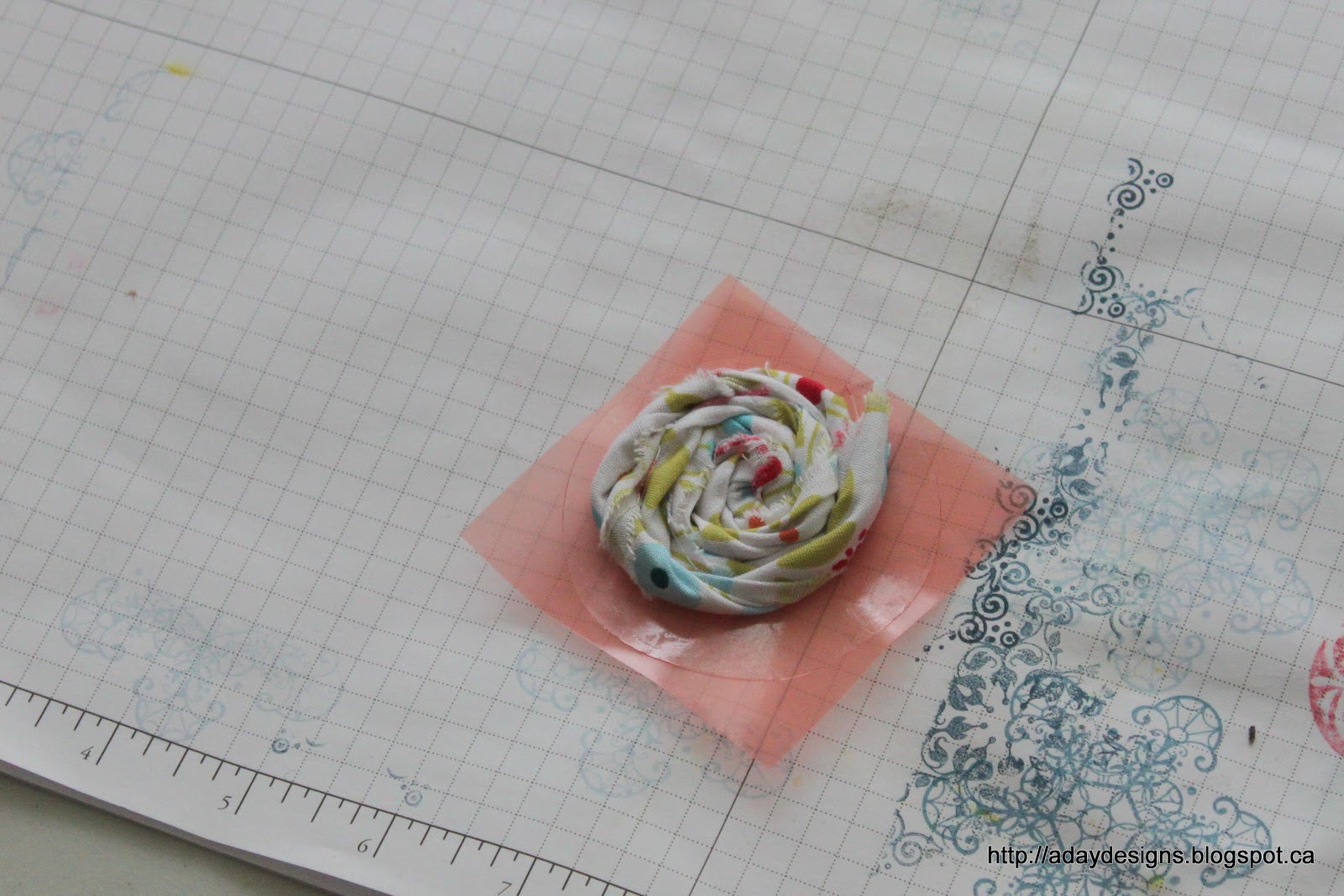
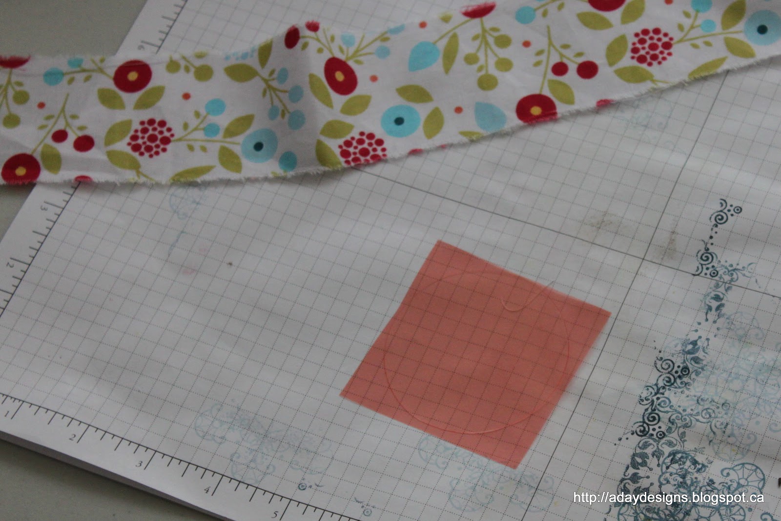
3. Keep twisting your fabric as you roll it around and around from the centre out until you are left with something that looks like this. The longer and thicker your piece of fabric the bigger and fuller your finished flower. I punched out a 2.5″ circle of white card stock and used my pinking shears to pink the edges. Once it was mounted onto this I added a button and called it done! 
I used smaller scraps of the brown fabric to make another flower – here’s a close up of that one.
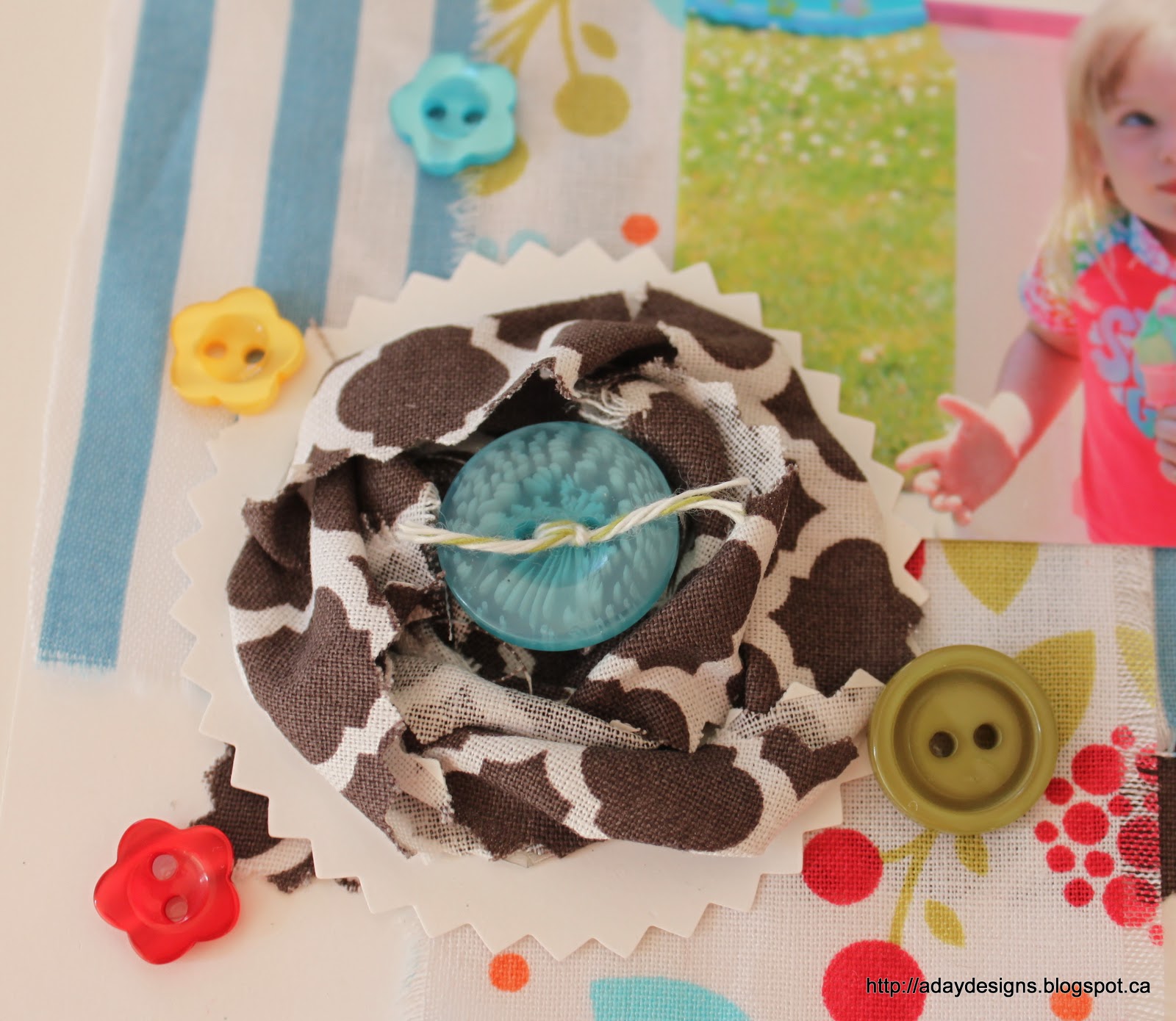
The strips were narrower and shorter so the flower is looser and smaller than the other one on the page.  
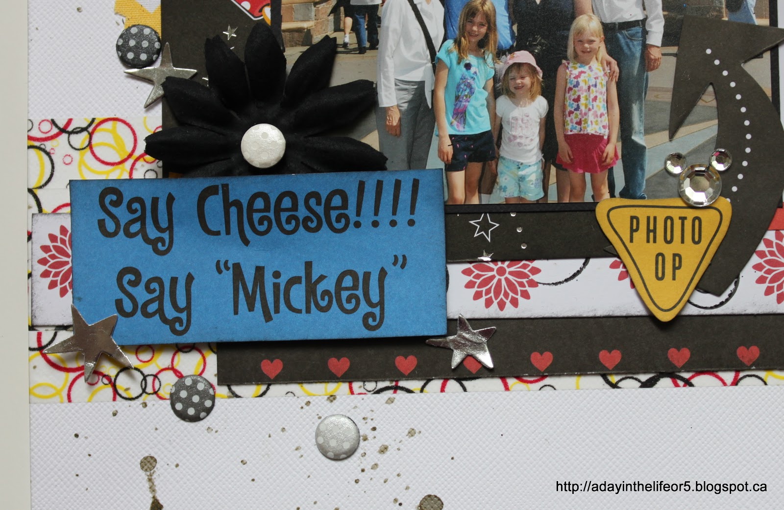
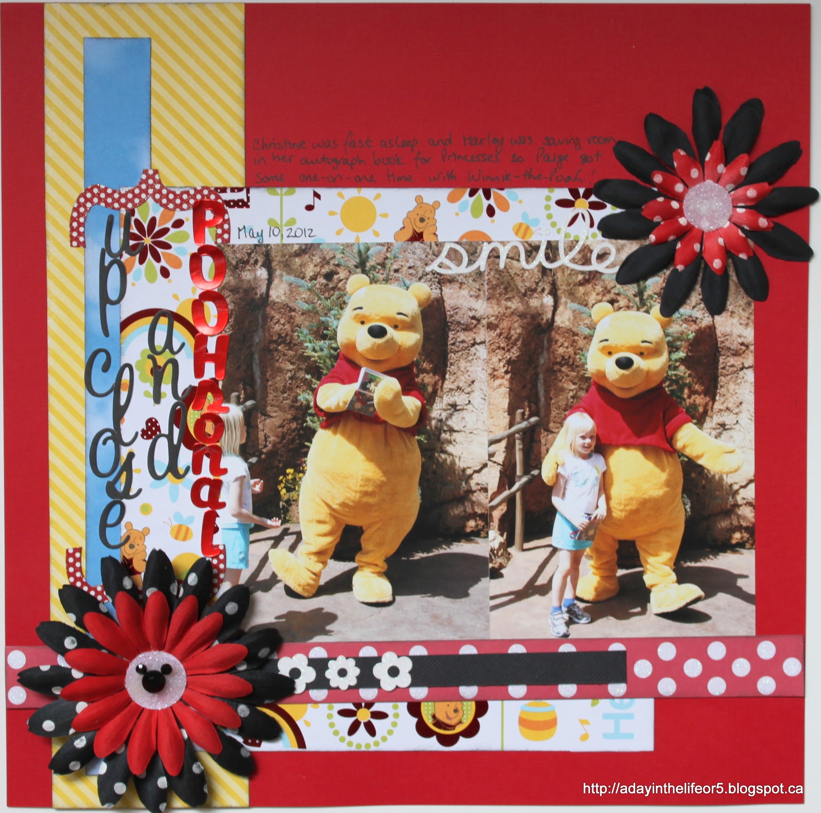
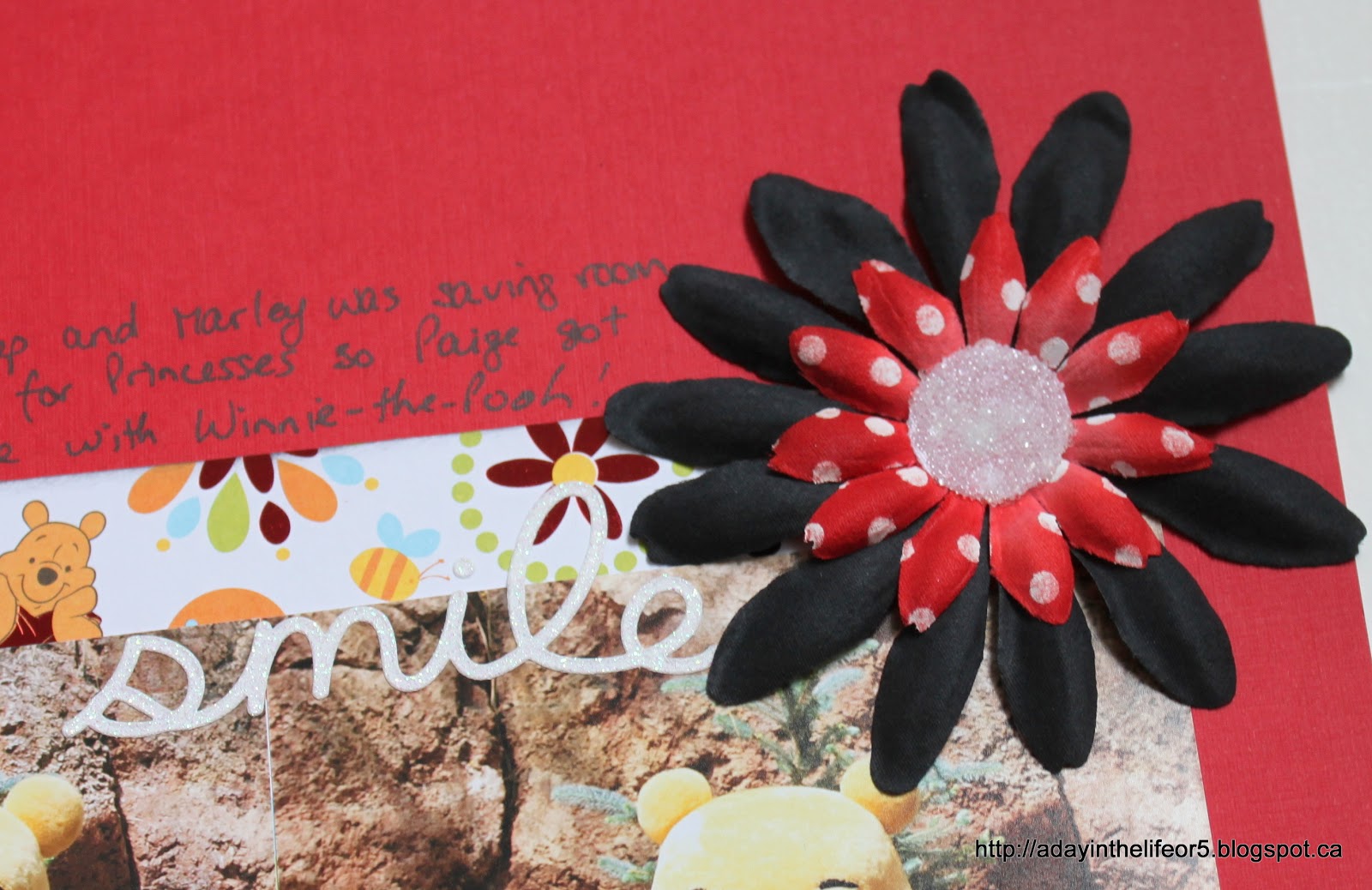
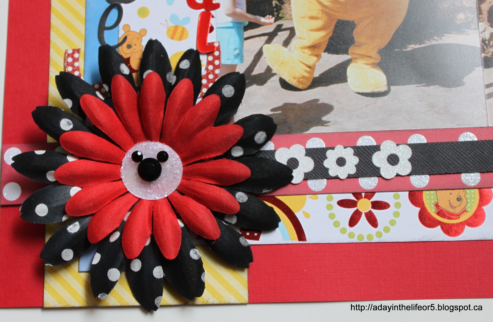
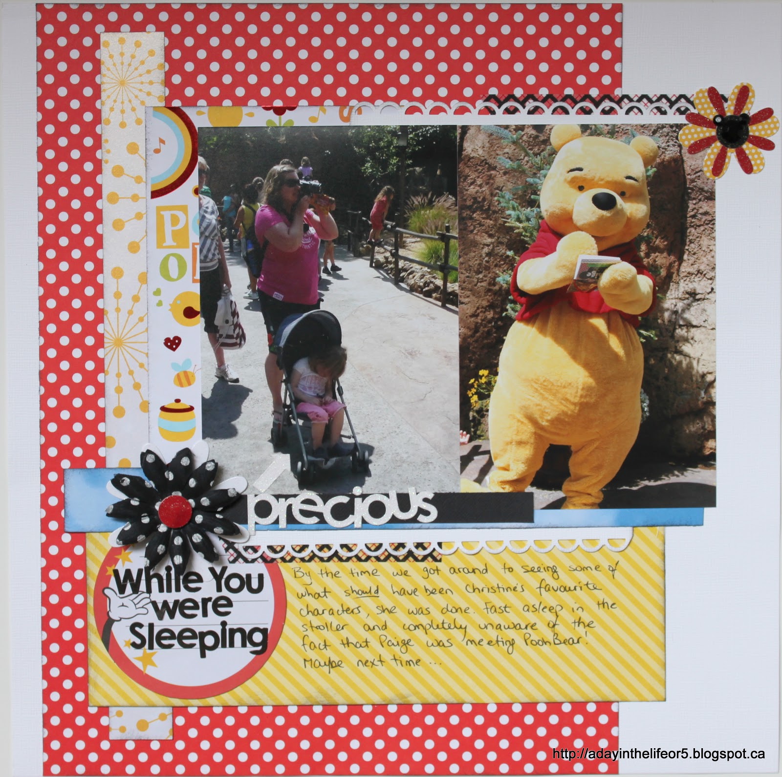
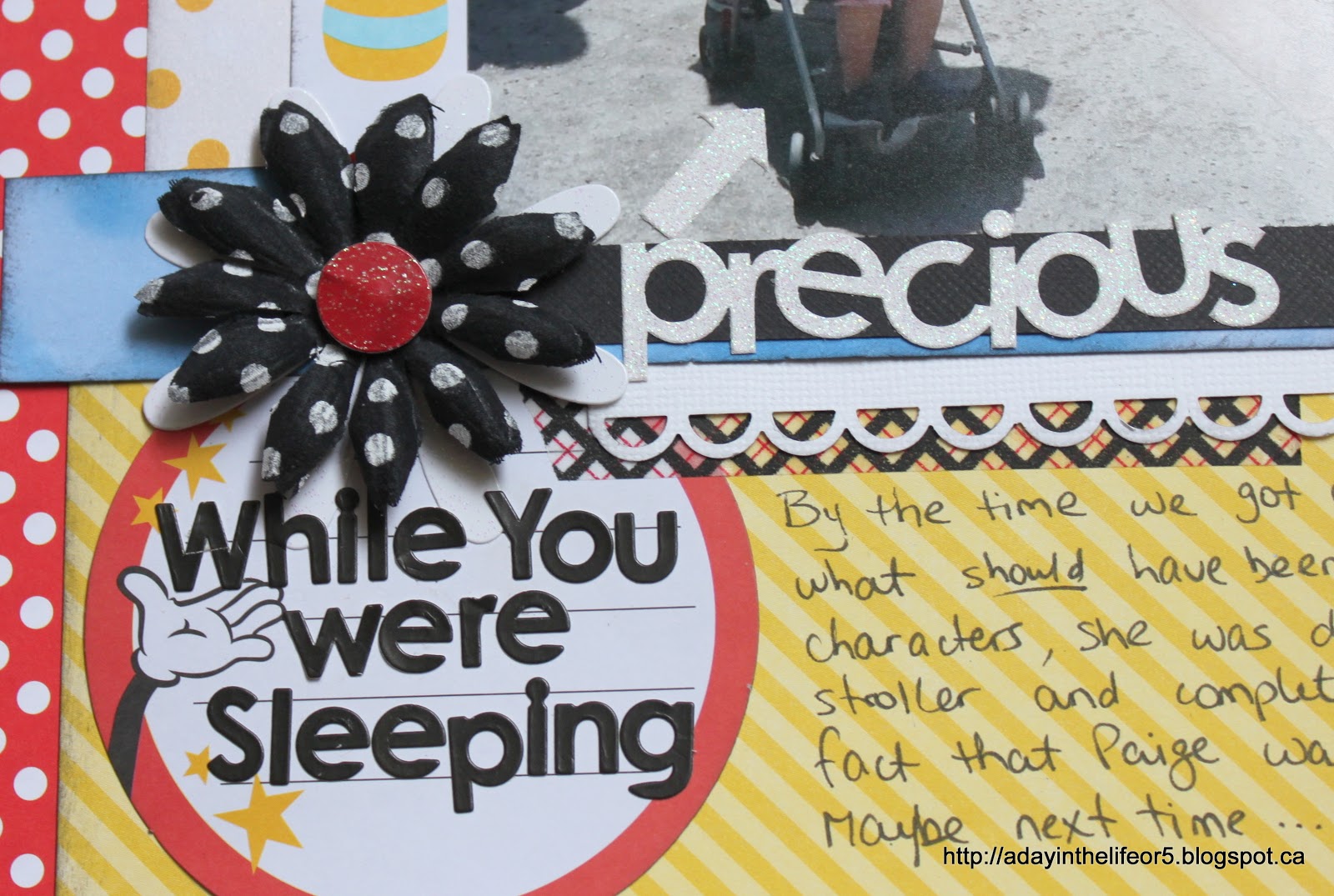
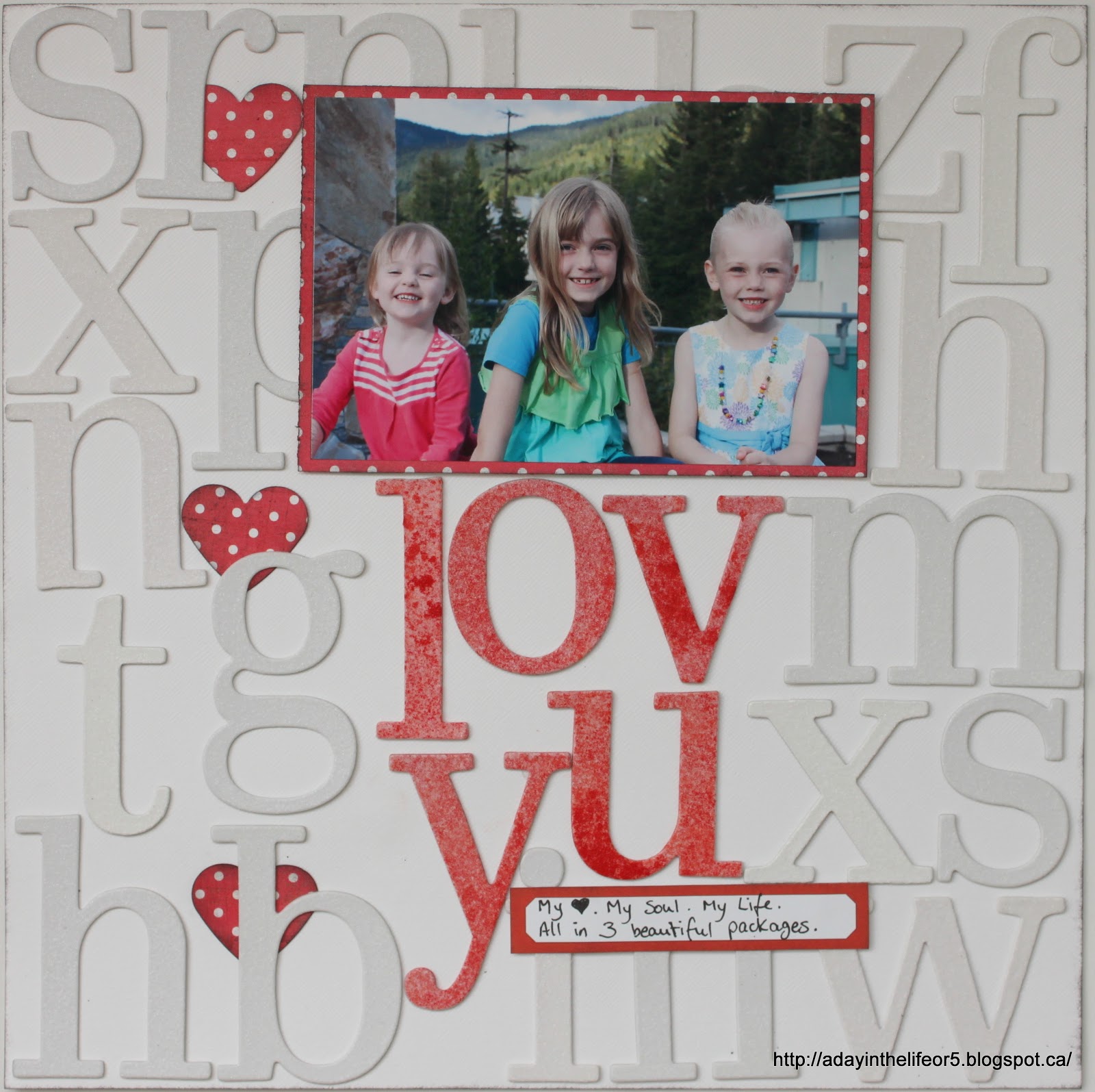
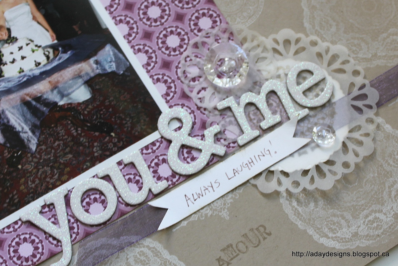
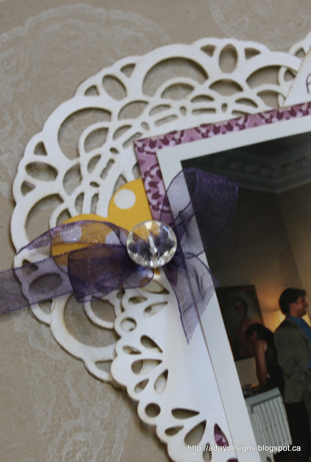
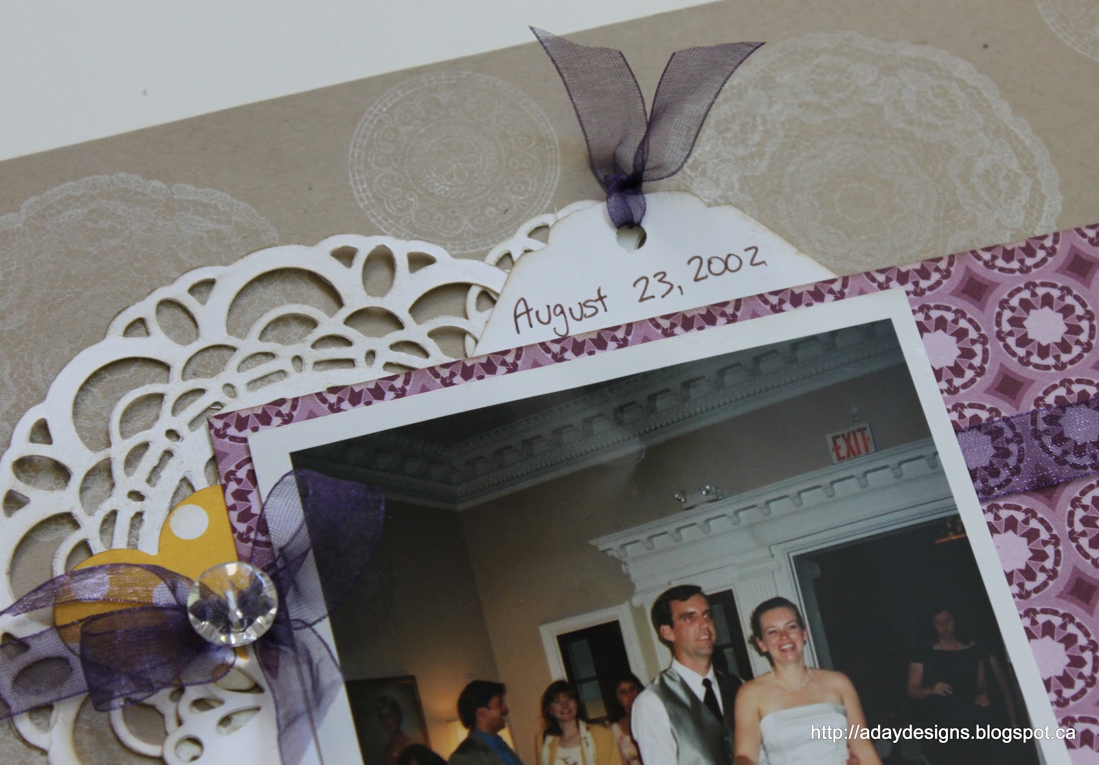
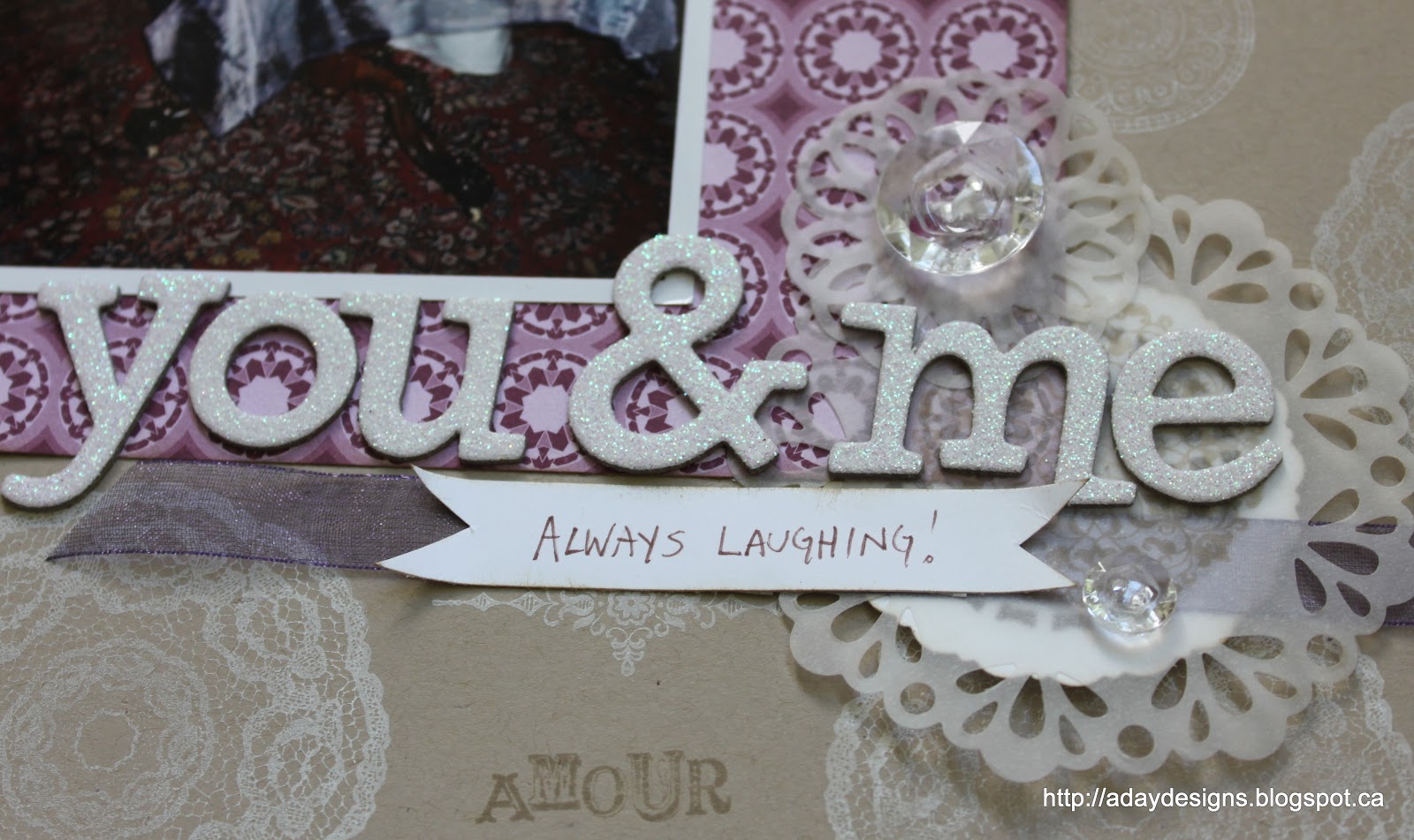
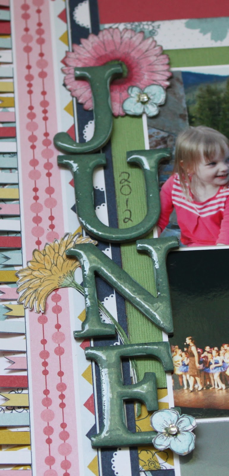
One last way to use fabric on your layouts … as trim like I did to anchor the photo on this layout.
Yes, that is yet another variety of fabric flower but this post is already reaching epic proportions so I think we’ll save that for another time. 
Thanks for joining me today as we explored my second favourite thing to stock pile … FABRIC! As always, please leave a comment sharing ways in which you’ve used fabric and I’ll be sure to pop over and check it out. 

Here are your links for products featured in today’s post:

Posted in Cards, Fabric, layout, Practical Scrappers, Tutorial | 2 Comments

Continuing with Disney

I realized I had several assignments due today for various scrapping commitments but before I got to them (sorry, can’t show you them yet) I wanted to finish off the Paige and Pooh Bear story. On Tuesday I shared two pages with you and mentioned I had more pictures and another story I still wanted to tell. Here it is.

I’ve been wanting to try out scrapping in these divided page protectors for awhile and I’ve got to say, I really like them. What a fun and easy way to add a ton of pictures while still allowing your creative juices to flow!
Anyway, here the story is about Paige overcoming her fears of mascots and people in full body costumes. This trip would not have been possible if Paige had been her old scared self! As I said in the post on Tuesday, Christine was fast asleep and Marley uninterested in getting Pooh’s autograph so it was just Paige and Pooh Bear. She did awesome and I am so glad I had a ton of pictures of the event and could properly celebrate this developmental milestone in my scrap book pages!!
Speaking of which … here is the layout side by side with the first of the Pooh Bear pages – this gives you an idea of how it will look in the album. 
And some close ups – sorry about the glare. It’s next to impossible to take a picture of something in the page protector without getting glare!

There’s the Mickey bling again! 🙂

I wanted to make sure this page looked like it belonged next to the other one so I tried to use similar colours. I didn’t have anymore of the Pooh Bear paper or the yellow striped Echo Park but when I found this yellow hexagon (an older Echo Park) I knew it was serendipity! Honeycombs for a honey loving bear?! Are you kidding me? How perfect!

The back side of the paper has these cute bees on it plus it’s blue which ties back to the slight bits of blue in the original pages. To further tie everything together I introduced papers seen in the other pages as well as design elements like the border punch and the alphabet stickers, washi tape, flowers, bling, etc.
Here is the back side of the divided page which has the continuation of the story on it. I basically just put an arrow at the bottom of my journaling on the one side (see above) and an arrow at the top of this page and kept writing!

And this is how it will look in the album next to the second of the original Pooh Bear pages (the one about Christine sleeping through the whole thing!)

I used Elle’s Studio journaling tags for all the journaling on these two pages. Love this one with the doily image on a yellow chevron!

Another tying element are these word stickers (I used “Celebrate” in the title on the other side). With another Elle’s Studio tag, it creates a nice little addition to the photo and the story.
Well, there you have it. What do you think? Do you use divided pages in your scrapbook albums? I’d love to see how you’ve used them if you can leave a link in the comments section I’ll come check them out. 
Thanks for stopping by today. I’ll try to get another family update posted tomorrow but if not, have a great weekend!

Posted in Disneyland 2012, layout, Paige | Comments Off on Continuing with Disney

Making a Start

WAY back in July (sheesh, is it already August?!) I made my foundation pages for our Disneyland trip album. I thought I’d manage to quickly whip off a bunch of pages even after the girls returned from their week with their grandparents. Ha! Here we are a month later and I have finally made a start on the album. I was spurred to action by a couple of challenges. The first is the Creative Accents August challenge to use the colour yellow (features pretty heavily in my foundation pages) and the second was this week´s sketch at Sketch Inspiration.

Starting with the page for Creative Accents …

This will be the title page of the album. The yellow chevron circle is actually fabric – Stampin`Up Essentials Designer Fabric to be precise – which I cut with my pinking sheers. I loved the bright happy yellow and felt it was the perfect way to start the album. This page was created brand new for this challenge (i.e not one of the base pages I’d created) but it will fit in perfectly as I have kept all the patterns and colours consistent by using leftover scraps from my other pages. Also, none of the other pages have embellishments on them yet so I can create continuity that way too. 
The title. The Disney Vacation plus the balloons/fireworks was a title sticker while the May 2012 were added using glittery foam letter stickers. 

I figured the title page probably doesn’t need a ton of journaling so this little tag did the trick.

There are a few things I mean to add to pretty much every page I do and you can see some of them here. The fabric flower, the dots (I think they are called Candy Dots) and the Mickey head shaped bling. I’ve got a few different washi tapes that will get added here and there as well as little word phrases (cut out from a 12×12 piece of patterned paper.)
This next layout is for Sketch Inspiration using this sketch.

I wanted to use these portrait oriented photos so I made some changes to the sketch to accommodate them. It’s not too far off though.
This is one of my pre-made base pages but the paper strips in the background worked for the sketch. 

More fabric flowers on this one as well as a word sticker.

Instead of the horizontal element shown at the top of the page in the sketch, I chose to anchor my photos with a horizontal element at the bottom of the page. You can also see the Mickey gem too!

My title may be a little hard to read so I’ll write it out here again – Up Close And POOHsonal. Ha, ha, ha!! A little play on words there!! The journaling explains it. It reads: “Christine was fast asleep and Marley was saving room in her autograph book for Princesses so Paige got some one-on-one time with Winnie-the-Pooh!”
I have quite a few pictures of this particular event and had created a companion page during my base layout stage. This is not a double page spread but they will face each other so there is more “communication” between the two single page layouts than you’d normally see. Here is it – While You Were Sleeping – and tells the other half of the story.

I used a sticker journaling spot for the title and wrote my journaling directly onto the back ground paper. To further anchor the photos I added the other half of the strip of black card stock from the layout above as well as some washi tape and white border punched card stock. The word sticker seemed appropriate!

Here’s a better look at the anchoring line.

I added the Mickey gem to the flower accent in the top right corner. I also repeated the washi tape and punched white card stock up here.
I still have more pictures of Paige with Pooh Bear and more story to tell (like how awesome it is that she will now hug mascots when she used to run away in terror!) so I will likely add a divided page protector between these two layouts with those photos. I didn’t get to that today though.
Well, that’s all I have for you today. Thanks for stopping by!

Posted in challenges, Disneyland 2012, layout, LC, Paige | 3 Comments

Get a Jump Start on Christmas!

Do you always feel behind the 8 ball when it comes to getting those Christmas cards out in a timely fashion? I am totally speaking from experience here!! How would you like to start now? I can help with some simple card ideas, all you have to do is head on over to my EventBrite site to sign up.

http://christmas2012cardclass.eventbrite.ca/

We will be using this bundle – Ornament Keepsakes …

And this stamp set – Snowflake Soiree …
To make some fun and striking cards. I hope you’ll join us. The cost to make 6 cards is $15 and for 12 is $30. Please use the EventBrite site to RSVP. Thanks!!
Maybe stamping some snowflakes will trick us into feeling a tiny bit cooler in this glorious heatwave!!

Posted in Cards, Christmas, Classes | 1 Comment

Celebrating the number 3

Practical Scrappers is celebrating their 3rd Anniversary all week and today the Design Team created projects highlighting the number 3. Since I have 3 gorgeous girls, I decided to feature them in this layout.

I have been wanting to do something like this for awhile. I’ve seen lots of examples on various sites but I’m afraid I can’t give a specific shout out. I’d say I’ve been inspired and influenced by many!!
During  my pre-garage sale purge I found a few packs of these large glittery white alphas. One was complete and unopened so it went into the garage sale pile but the incomplete ones stayed in my stash. I pulled them out for this layout and prayed I had the letters I needed. Well … I had almost all the letters! I took the L, O, V, Y and U and sprayed them with a couple different Mister Huey’s to get a reddish pick colour. It’s a pretty close match to the patterned paper which was my goal. I wanted all the design elements (photo, title and journalling) to read as one block in a sea of white alphas. 
Here’s a closer look at the title and journalling tag. I used an Elle’s Studio tag – the journalling reads: “My {heart}. My soul. My Life. All in 3 beautiful packages.”

I tucked 3 punched hearts under the letters to represent my 3 daughters.
Well, I hope you enjoyed this. I had a lot of fun doing it and may try this technique again. I am never at a loss for half used alphabet sets!! Remember to enter the giveaway over at Practical Scrappers!
Have a great week everyone!

Posted in layout, LC, Marley, Paige, Practical Scrappers | Comments Off on Celebrating the number 3

Using Some Twelve Inspiration

I have been participating  (or trying to anyway) in Stacey Julian’s Twelve class over at Big Picture Classes all year. I was really good up to about May and then I sort of fell off the wagon. I was still creating layouts (as evidenced on my blogs and galleries) but I was forgetting to use my designated Twelve embellishments (we all pulled out minimum 144 different embellishments in 12 colours and keep them stored in a muffin tin to be added one to each layout completed) and I was definitely not thinking about what I was creating or why. Anyway, I just finished the first layout of the year using a piece of Inspiration from Stacey herself. At the beginning of every month Stacey posts 12 new Triggers on the class site. They are designed to inspire us to create, think or just for our viewing enjoyment. As soon as I saw the triggers this month I jumped up to create this …

It was inspired by this layout by Stephanie Howell.
I knew I had multiple doily stamps that I could use to recreate the look of her background paper and the doily Sizzlits dies in the catalogue would be perfect for the embellishments. I used Gossamer Lace, Lacy & Lovely and Artistic Etchings in Craft White on Crumb Cake (the Amour stamp is also from Artistic Etchings and is in Crumb Cake ink) to create my background image. 

We used accents of purple at our wedding so I looked for some purple patterned paper and found this one in International Bazaar. I knew that I wanted a different title work than my alphabet stamps or my alphabet dies could give me so I had to turn to my non-Stampin’ Up stash for some glittery AC Thickers. 

I cut out several different doilies using the Delicate Doilies and Paper Doily Sizzlits. I cut them out in both Whisper White and Vellum intending the layer them. In this picture you can see the large Paper Doily with a smaller doily from the Delicate Doilies both tucked behind the picture block. The purple ribbon is also not from Stampin’ Up – it’s actually leftover from creating our wedding invitations! I accented the bow with one of the Vintage Faceted Designer buttons. The yellow heart behind is punched from Echo Parts Dots and Stripes and is my Twelve embellishment indicating that this layout was based on some sort of Inspiration. (Yellow is my Inspiration colour.)

I tucked my journalling behind my picture on a little tag I created from a leftover scrap of Whisper White card stock. 

Here’s what that tag looks like.

Last but not least is the embellishment cluster behind the title. One of the smaller doilies from Delicate Doilies in Whisper White  with a couple vellum ones over top. Another couple Vintage Faceted buttons, some more ribbon to ground everything and a little hand written label that adds a bit to the title.
I am really pleased with this layout. I haven’t scrapped any of my wedding pictures yet and now kind of feel inspired … we’ll see! I will for sure be creating more customized background papers though!
Thanks for stopping by today. I’d love for you to become a follower and leave a comment telling me if you’ve ever created your own background papers before.  Here are your links to Stampin’ Up! supplies featured in this layout.

Posted in layout, Twelve | 2 Comments

Project 12 for June 2012

I’m back with another layout for my Project 12 album. July is almost finished which led me to start thinking about this project, which then led to realize I’d neglected to do my June 2012 layout. Using another sketch from Pagemaps and the Patio Party DSP collection I came up with this.

This is the sketch I used from June’s Pagemaps.
Here’s a close up of the left hand page. 
And the right hand page. 
As you can see I stamped a tone on tone border on 3 sides of the layout using Flowering Flourishes. I embellished some of the flowers with rhinestones – the last thing I did to finish off this layout!
Again I have used WAY more photos than the sketch called for but to keep them from overwhelming the layout I created a grid pattern and mounted them all onto Whisper White card stock. This left me with just enough journaling space for what I had to say!
Some more close ups for you .. starting with the title.

This technique should be pretty familiar to you all by now. I cut out my title using some leftover chipboard and my Typeset Alphabet die for the Big Shot. I then inked them in Baja Breeze (including inking the edges with my Baja Breeze Stampin’ Write marker) and then flooded them with Cyrstal Effects.

The Patio Party DSP collection includes a sheet with lots of different patterns in strips – perfect for creating borders. I liked these banners and had originally left them uncut but felt the layout needed a bit more texture and interest. I got the idea of fussy cutting all the little banner flags out and really love the final look. It was literally a pain to do – my hand was seriously cramping by the end of it – but worth it I think!

To embellish the journaling block I played with the Reason To Smile stamp set (a special right now – see my side bar). It is a double stamp stamp set. This means you get a solid image for each flower plus the outline/detail stamp. I knew I was going to be cutting them out so I wasn’t too concerned with stamping within the lines. In fact, I stamped the small blue flowers multiple time which gave them a cool layered look! Once the base colours were stamped I got out the coordinating Stampin’ Write markers and added some shading and depth. I also used my blender pen to give it a more realistic look.

A closer look at the back ground stamping.

In this picture you can see the subtle texture that the solid flower stamp have.
Thanks for coming by again today. Do you document each month in any way? If so I’d love to check it out. Please leave me a link in the comments section. Hope you have a wonderful, sunny Tuesday!
Here are your links for products featured in this post.
Reason To Smile stamp set (only $5 with a purchase of $60 ENDS TODAY!)

Posted in layout, Project 12 | 1 Comment