Just for the fun of it!

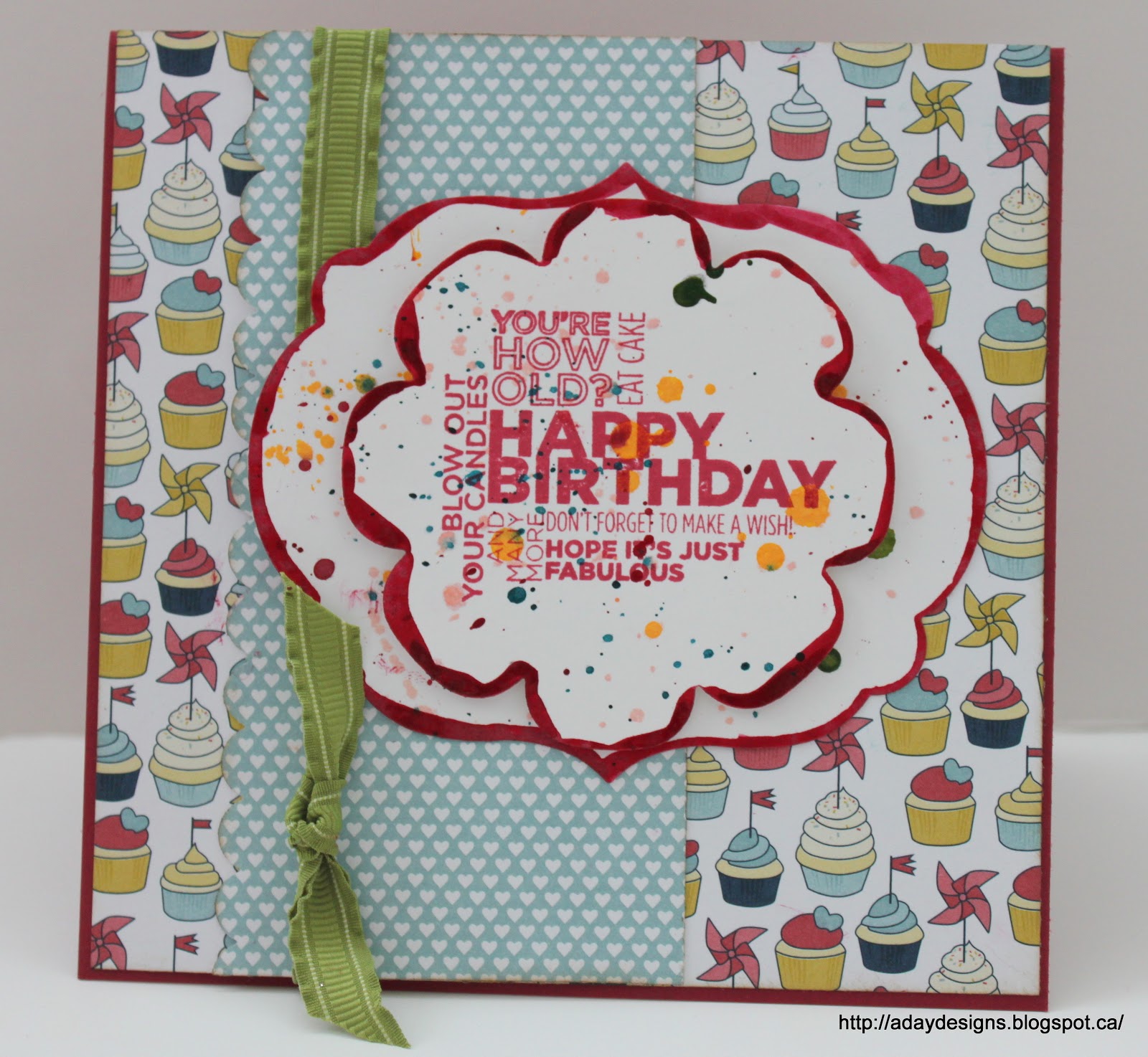
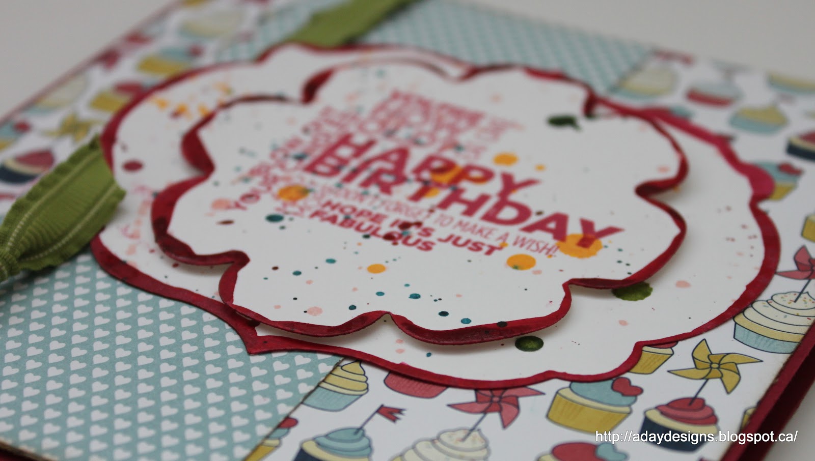
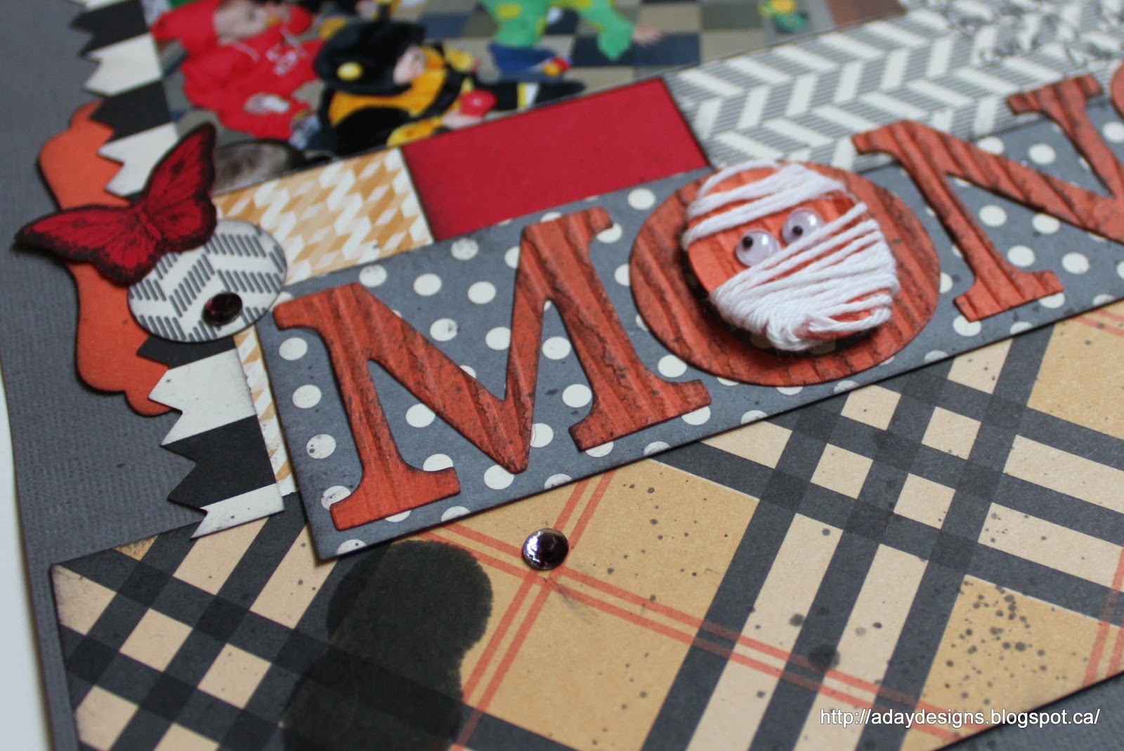
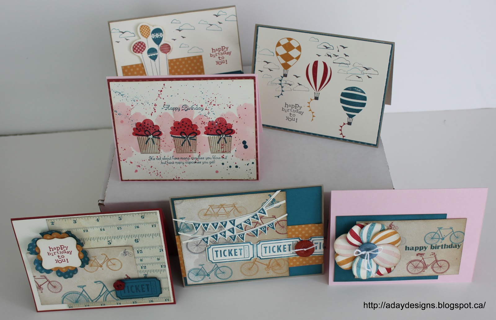
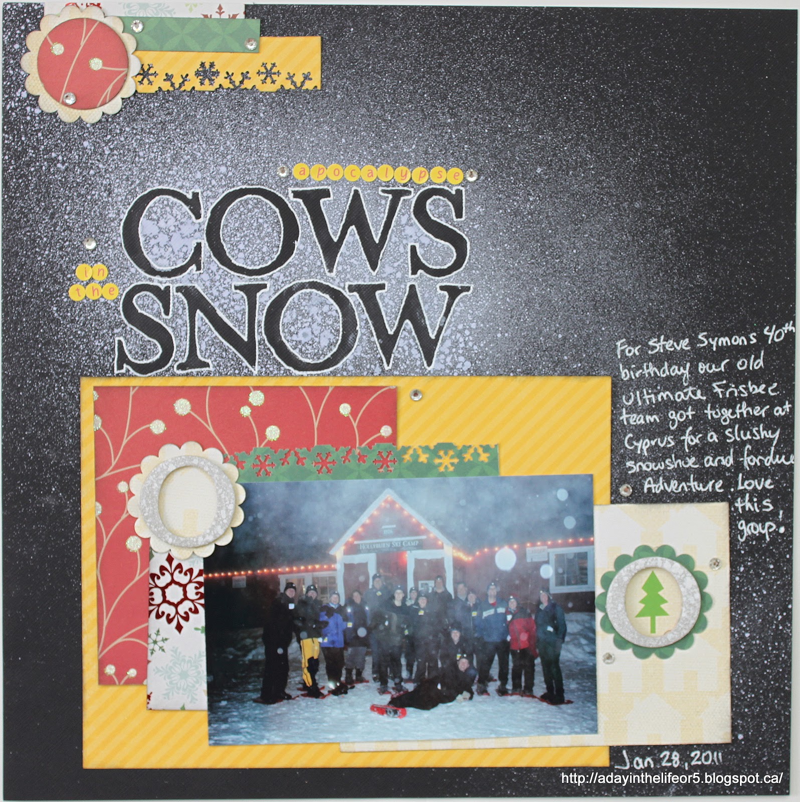
The title really says it all. I wanted to play with one of the new stamp sets from the 2012-13 IBC so I just started stamping and having fun. The stamp set I was playing with was Daydream Medallions. My upline Sandra had featured a card (and this one too) on her blog using this set and it got my creative juices flowing. I wanted to use it on a layout though and here it is.

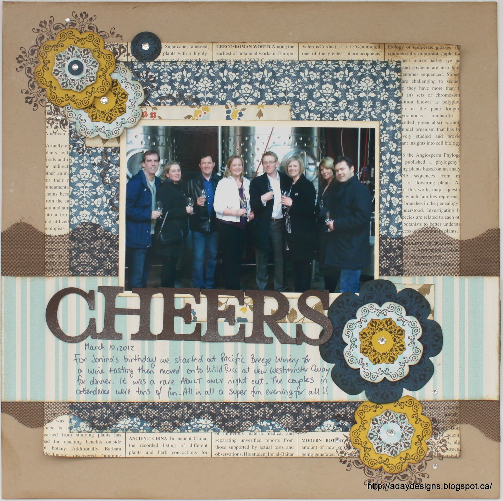
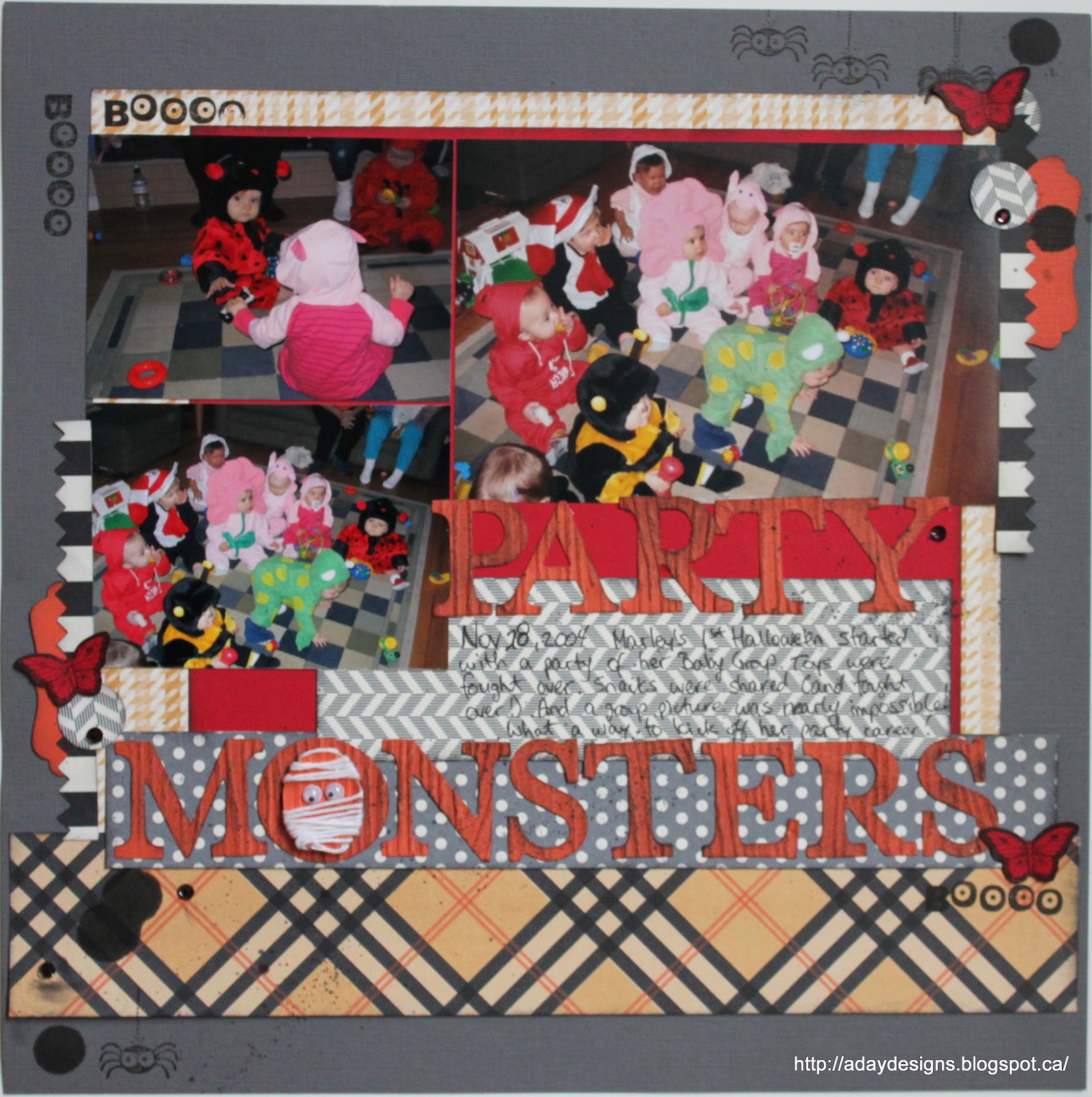
Usually when I start a layout I know what pictures I’ll use but this time I started with the oddest of things … that scalloped tulle ribbon. I’d created a card using the ribbon to make a flower and had a large piece left over that I though would look cool layered onto a layout. It’s Early Espresso in colour which led me to pick the First Edition Specialty DSP, the Crumb Cake card stock base and then the Comfort Cafe DSP pieces. With the basic building blocks in place it was time to hunt for a photo. This one is incredibly blurry as it was taken with someone’s cell phone but as it’s the only one I have from that night, it’s a keeper. 
And then it was time to start stamping.

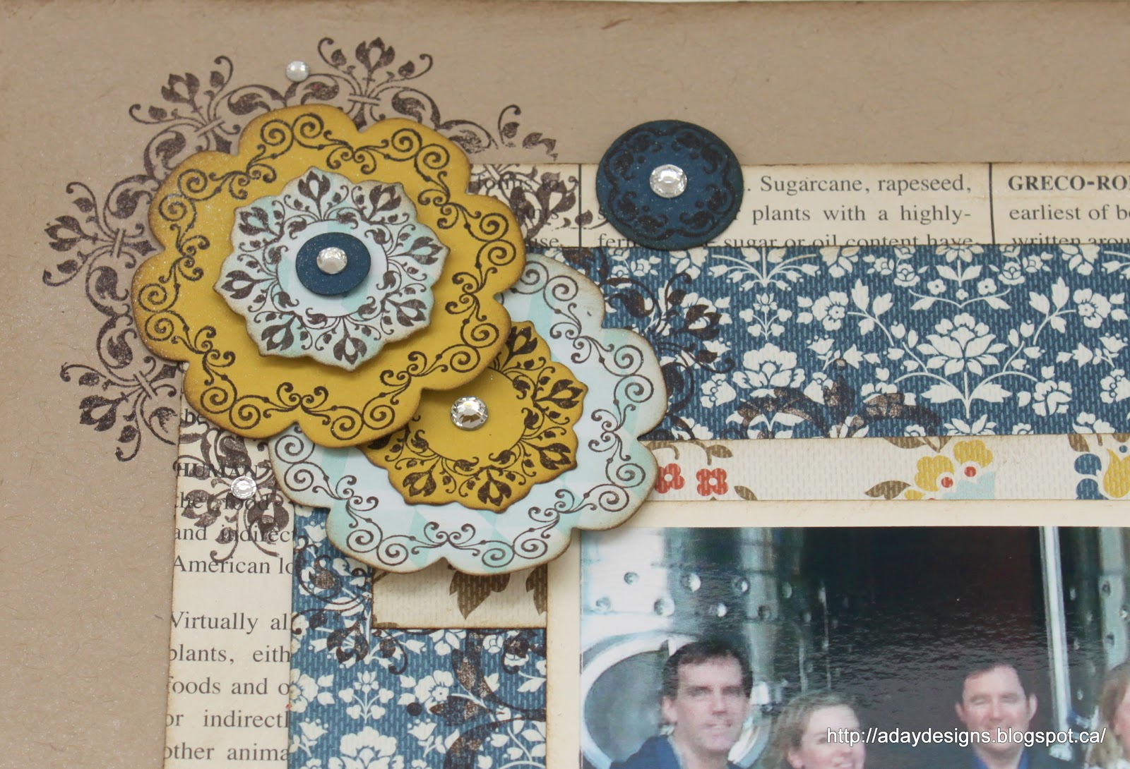
I started by stamping the largest image onto the blue floral patterned paper in approximately where the corners of the photo would end up. But since it is barely discernible, I took the next size down image and continued stamping up into the top left corner of the layout and down into the bottom right corner. The embellishments were made by stamping more images onto different coloured card stock and using the Floral Frames Framelit dies (which are designed to fit the stamped imaged perfectly) to cut them out.

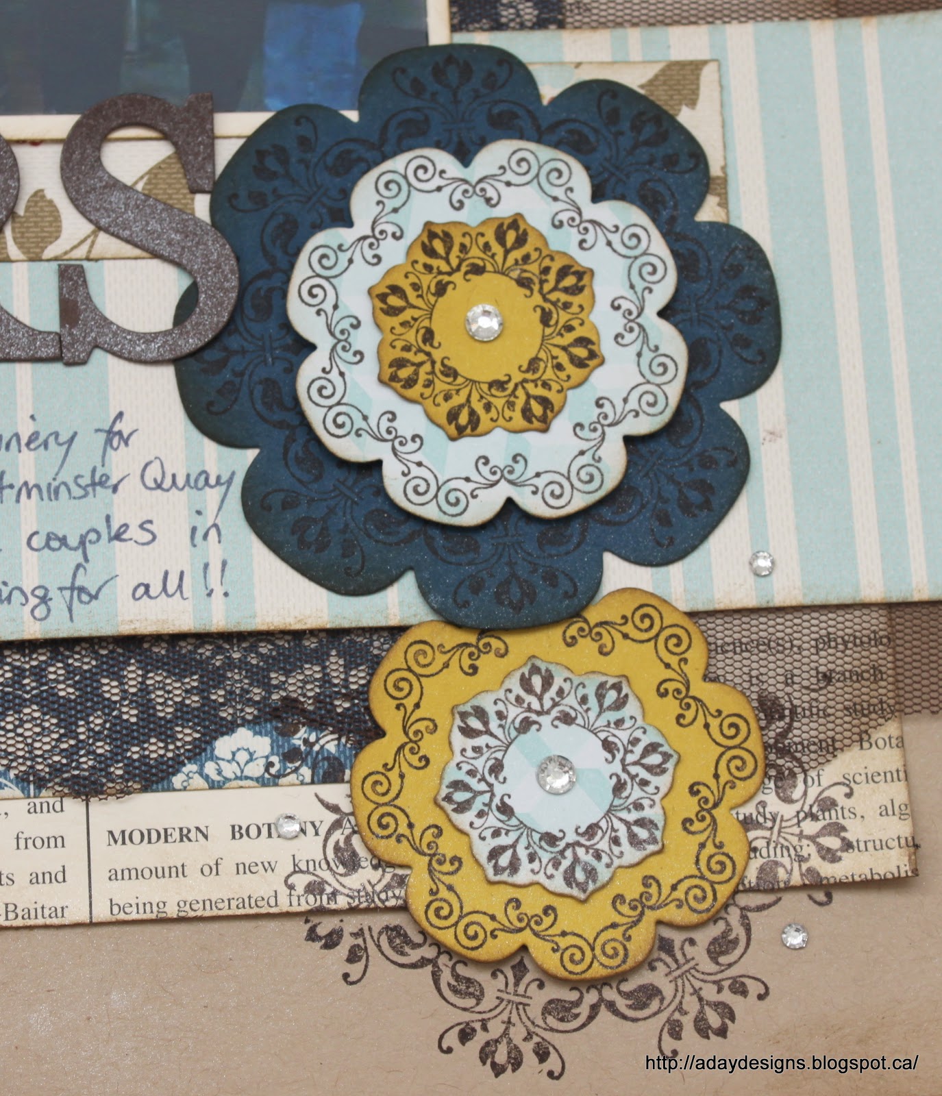
I popped up some layers using Dimensionals and added rhinestones to the centres for added bling. I also scattered some smaller rhinestones around the embellishment clusters.

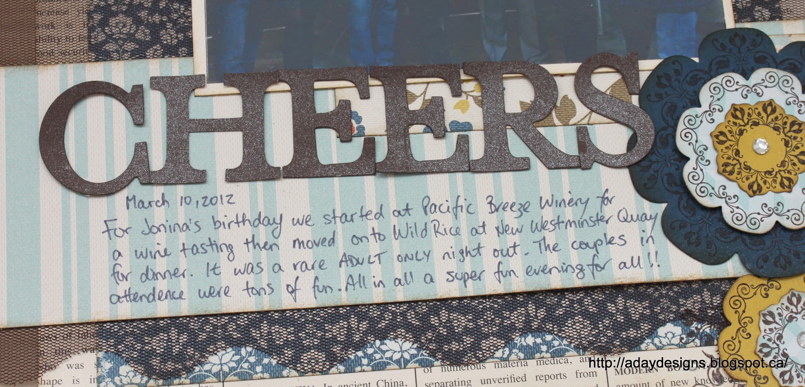
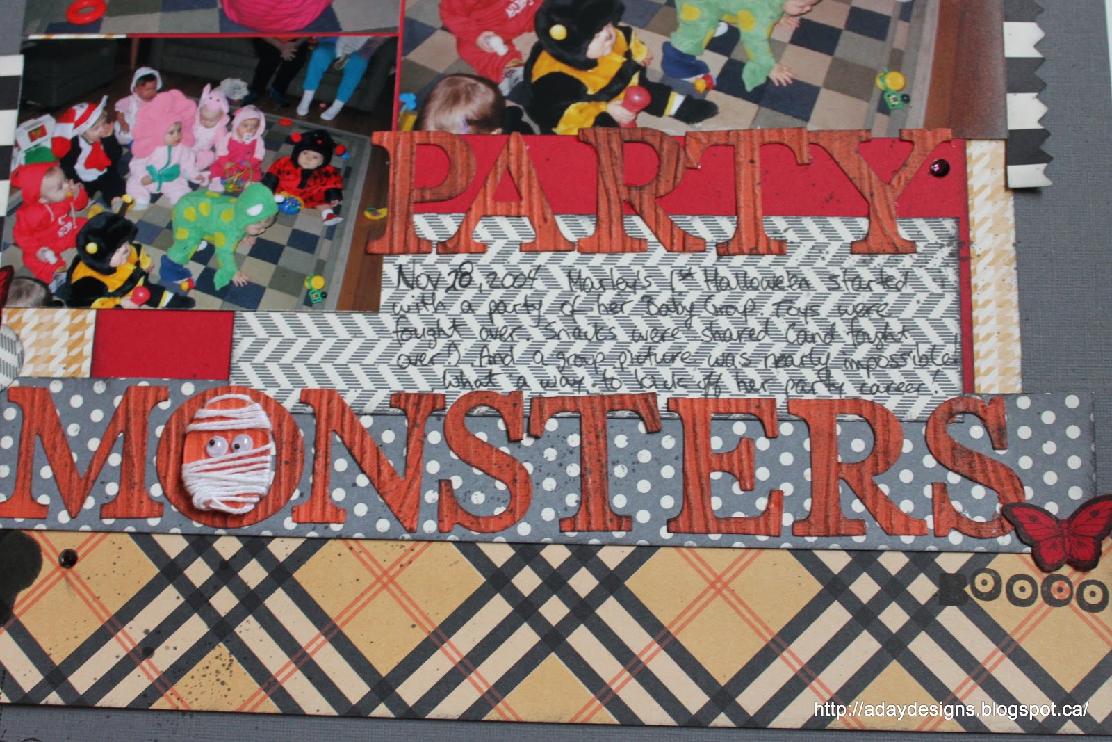
I don’t know if you can tell from this picture (maybe click on it to make it bigger) but I sprayed the Early Espresso card stock title letters with Vanilla Shimmer Smooch Spritz to give them some added texture.
I had a lot of fun creating this layout and can see many uses for this stamp set – both for layouts and cards! Thanks for stopping by today. Here are your links for the products featured in this post.

Daydream Medallions stamp set
Floral Frames Framelits Dies
Vanilla Shimmer Smooch Spritz
First Edition Specialty DSP
Comfort Cafe DSP
Basic Rhinestones Jewel Accents
Early Espresson 3 1/2″ Scalloped Tulle Ribbon – available August 1st!

Posted in layout | 1 Comment

Splatter Birthday Card

My eldest daughter attended a birthday party the other day at 4Cats Art Studio and she needed a card. She’d been to a birthday party at 4Cats before – a Splatter Paint party – so she asked me to make her a very specific kind of card. One with paint splatters on it!
Ever the accommodating mother and always up for a challenge, I got to work. Here’s what I came up with.

I used Primrose Petals card stock for the base and Patio Party DSP for the back ground accented by a piece of Lucky Limeade 3/8″ Ruffled Ribbon. 

To create the splatter effect I used 5 different colours of Mister Huey’s mists by Studio Calico (not a Stampin’ Up product obviously but I wanted a more opaque look than Stampin’ Up inks could have given me) and simply splashed them randomly onto some scraps of Whisper White card stock. I cut out a flower shape using the Floral Frames Framelits dies and an oval label shape using the Labels Collection Framelits Dies. I then stamped the Happy Birthday sentiment from Delightful Dozen in Rose Red and used one of the mists to paint around the edges of each die cut shape.

Popping up the centre piece adds just enough dimension to keep the card from feeling too flat.
Well, there you have it. Hope you liked this latest card creation!
Here are your links for today:
Primrose Petals card stock from the 2012 – 2014 In Colors Collection

Posted in Cards | 1 Comment

Starting Point Layout – Party Monsters

I managed to finish the latest Starting Point Layout this afternoon. If you stopped by earlier today you saw a sneak peak on this post. To see Shimelle’s Starting Point post please go here. I am having so much fun with these! I think I like this idea better than a sketch. Gasp! Is that wrong? 🙂 I have my reasons though. Sometimes I find sketches tough if I have more pictures than it shows (not surprisingly this frequently happens to me) or my title and/or journalling don’t fit where the sketch suggests putting them, or my embellishments are the wrong size, etc. I know that the whole idea of a sketch is to help with the placement of design elements to make the whole process faster but to be honest, using them almost makes me scrap slower. Maybe it’s the rules follower in me that feels the need to actually follow the sketch!! LOL! Whatever the reason, I find Shimelle’s starting points freeing. It’s like once the background is in place I am free to fit my photos, title, journalling and embellishments where ever I want. Sound crazy? Give it a try and then tell me if I’m crazy or not!!

Anyway, enough rambling. I knew I wanted to play with the new Hallowe’en DSP and when I went hunting for photos I found ones of Marley’s first Hallowe’en party. I even had the exact number and sizes of photos that Shimelle had used. It was total kismet!! Here is my finished layout.

And here’s a reminder of how I started.

The new papers from Stampin’ Up! (Howlstooth and Scaringbone) don’t have any red in it but my pictures did so I used my designer discretion to add a block of Real Red to mat the photos onto.

The title was (of course) cut out with my Big Shot using the Typeset Alphabet dies but before I did that I embossed the Tangerine Tango card stock with the new Wood Grain embossing folder. I also lightly brushed  the raised parts with Basic Grey ink.

And then I had a bit of fun. In the soon to be released Holiday Mini Catalogue is a kit to make treat bag labels. It uses a new stamp set called Googly Ghouls and comes with googly eyes. I used the spider and BOOOO images elsewhere on the layout and then came up with the idea of turning the middle of the O into a mummy using the googly eyes and some white bakers twine. Isn’t he cute?

Here’s a look at the spiders. Also in this picture are some large ink splotches (straight from my re-inker bottle), some smaller ink flecks (using my Aquq painter), a rhinestone that I coloured black with a Sharpie and a red and black stamped butterfly image from Papillon Potpourri. I felt I needed to bring some of that red out from behind the pictures and spread it around a bit.
Well, that’s it. Thanks for stopping by. Enjoy your weekend everyone and here are your links to available products featured on this layout.

Posted in layout, Starting Point | Comments Off on Starting Point Layout – Party Monsters

Shameless Plugging!

I know I have been a bit MIA on the blog but I have been working my butt off behind the scenes. Promise!!

On what, you ask? Well … cards, layouts, and pricing my stash. Huh? Pricing your stash? That’s right. I have a table in the Clipper Street Tailgate Garage Sale this Sunday (PLEASE stop raining!!!) so this is the current scene in my living room  …

Come on out and scoop up last season’s Stampin’ Up! products at over 50% off plus TONS of other manufacturers products that need new homes. I have completely culled my stash in an attempt to a) get it under control (I have a serious paper hoarding problem!!) and b) earn some cash to buy myself a Silhouette (no, I did not win the contest … boo, hoo!) I have a Cuttlebug plus 2 SETS of cutting mats for sale PLUS my Cricut

So … come on out to Clipper Street in Langley (click on the link to get directions) this Sunday July 22nd from 10:30 – 2:00PM. See you there!!

What else is on the agenda? You may have noticed the new box in my side bar for Upcoming Classes and Events. All the orange highlighted dates are dates for classes or drop-in scrap nights. Click on them for more information and to register. Next week I am happy to offer two dates for my new Birthday Cards for Kids Class – Wednesday July 25th and Saturday July 28th in the afternoon. Here’s what you could make …


Also next week is July’s Drop-In night (fondly called Vini, Vinum, Partum or I came, I drank wine, I created!) Pre-registration is a must for ALL EVENTS or else you run the risk of no one being home! Don’t want to pay by credit card? No problem. Just shoot me an email via the link on my side bar to let me know how many are planning to come and then pay by cash or cheque at the door. 


Also in the works in another Starting Point layout featuring the NEW (as in, not available to the public until August 1st) Hallowe’en line called Howlstooth & Scaringbone DSP.

Stay tuned to see how it turns out …
I must wrap this up now as it is almost time to pick up the older two girls from Vacation Bible School. They were told to wear their swim suits today but I don’t think the leaders meant for them to be swimming in the pouring rain! Sigh. Why can’t it just decide to be summer full time already?!?! Christine has missed her sisters this week as she is still too young for VBS (next year!) but she will have them all to herself next week as there are no camps planned. Boy I hope the sun shines all week! Otherwise I may go completely mental! 
Have a great weekend everyone. Remember to pop by my table at the garage sale on Sunday!!


Posted in Cards, Classes, Starting Point | 1 Comment

Practical Scrappers Feature – 10 Things to do with Vellum

If you received my newsletter the other day, I hinted that I’d have a project featured on the Practical Scrappers Blog today. I’d love for you to go on over there and check out all the gorgeous cards and layouts my fellow Designer Team members have created. Really truly amazing things can be done with humble vellum!

Here’s what I made.

A quick confession before I talk about the Stained Glass Technique … the large butterfly stamp and the sentiment are NOT Stampin’ Up! stamps. I looked for an image I could use with this technique but didn’t have anything large enough so I had to dig into my other stash. The butterfly is from an older Martha Stewart (I think) set and the sentiment is Studio AE by Technique Tuesday.
Okay, now that that’s out of the way, how do you get this look? It’s ridiculously easy (the colouring on the other hand … let’s just say I’m colouring challenged and leave it at that!) First find an image with lot’s of white space. Ink it up with Versamark and stamp it onto your vellum. Choose your colour of embossing powder (I chose black to mimic natures own colouring) and heat emboss it. Depending on the quality of your vellum, you may have to be careful at this stage. Stampin’ Up! Vellum Paper is really good and did not warp or burn. If your vellum is thinner you may want to use a Staz-On ink instead of embossing it.
Once your embossed image has cooled, flip it over and colour away. To get a more natural gradation in my colours I used the Blender Pen after using my Stampin’ Write markers. The Blender Pen is great! Not only can you blend the colours together so you don’t get harsh lines, but if you are like me and never learned to colour inside the lines, they even take OFF colour if you need to. Awesome, right? 

I’m not sure if I was able to capture it on film properly, but once your image is coloured and you flip it back over, the embossed lines resemble the lead used in real stained glass windows to separate each individual piece of coloured glass. 
I then mounted my vellum image onto Whisper White card stock and framed it with a piece of Tempting Turquoise patterned paper from the Brights Collection Designer Paper Stacks. The frame was created with the Labels Collection Framelits dies.
As an added embellishment I embossed an image from Papillon Potpourri onto Wisteria Wonder and punched it out with the matching Elegant Butterfly punch. I topped it with a Vintage Faceted Designer Button threaded with some black embroidery floss. I left the tails long to mimic the antennae.
Well, thanks for coming by to see my project today. Hope you liked it. It was a lot of fun to make! Here are your links for today.

Posted in Cards, Embossing, Practical Scrappers | 2 Comments

Canada Day Blog Hop Winner

Tara has crunched the numbers and come up with a winner for the Canada Day Blog Hop.


THE WINNER IS: Romaine! 


Please email Tara at creativeaccents@telus.net to get your $20 code to use at creativeaccentsonline.ca 🙂 

Bonus: Tara is offering ALL OF US a coupon code so we can save 10% in the online store this month. Just use the code CANADA10

Thanks for hopping along with us!

Posted in Uncategorized | Comments Off on Canada Day Blog Hop Winner

Practical Scrappers Feature – 10 Things to do With Chipboard

Over at Practical Scrappers we’re talking chip board today. Head on over there for some great ideas of different ways to use that stash of chip board (you know you’ve got it!!)

I used my chip board letters as a mask when misting to give me this great, “cut out of the snow” look.  This picture was taken on a snow shoeing trip in a yucky slushy kind of snowfall evening. The flash just picked up and reflected all the falling sleet so the picture has this kind of awful hazy quality to it. Instead of trying to hide it I decided to emphasize it by mimicking it with mists.

It was incredibly easy. First apply a bit of repositionable adhesive on the back of your chip board letters (I used my Big Shot to cut these out of chipboard packaging.) Once you’ve decided exactly where you want your title to be, spray the back ground card stock liberally with a mist colour of your choice. I used Mister Huey’s Calico White to give my layout the snowy look I wanted. Once I took off the letters and let the mist dry I outlined the letters with a white gel pen.

The group of us out that night used to play Ultimate Frisbee together and we were called the Apocalypse Cows so the whole title is “Apocalypse Cows in the Snow” but since we referred to ourselves as The Cows, I just made those two words the focus. I like the symmetry of them too! Almost a palindrome!!

As an added bonus, I used the sprayed O’s as embellishments. Here I cut out the centre of the scalloped circle paper behind the O to show the tree on this piece of Studio Calico paper. The paper is all little white houses on a pale yellow background with one lone fir tree. I liked the fir tree. It reminded me of the woods on Cyprus Mountain so I wanted to feature it.

I also got out my snow flake border punch to punch just two strips of paper.
Thanks for stopping by today. Be sure to go to the Practical Scrappers Blog for more great ideas from our oh, so talented designers.

Posted in layout, Practical Scrappers | 2 Comments