Hello again!
Not sure what happened to my 5 on Friday post … kind of whizzed through the whole weekend without even thinking about it. My apologies to those who like to read it. Not that I would know who that is anymore as Blogger is still not allowing comments on my Blog as well as me to comment of other Blogs (Roxy, I’m following you still!!)
Have I mentioned lately how much I hate Vista? Nothing but issues with this laptop since Day 1 and now that I mistakenly “upgraded” to Internet Explorer 9 I’ve had nothing but bugs on top of bugs. Grr!! If only I could afford to get a new laptop!!
But I digress … back to the reason I am writing this evening (and studiously ignoring the fact that the Canucks are getting their butts KICKED by the Bruins. Double GRR!!) … my layout for May 2011. In an effort to not leave it to the last possible minute, I started working on it a couple days ago. I just put the finishing touches on it (it was 3-0 and Greg had changed the channel in disgust so I figured I needed something to take my mind off the massive disappointment that was brewing!)
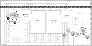
Here’s the sketch that we were given.
And here’s what I came up with.
More apologies are in order as I realized as I was editing my pictures that I forgot to take ones of each side. Oh well. There were a lot of “whoopsies” moments on this layout!
But first a few words about what I did. I noticed that the pictures I wanted to use for this month (I know, I know, I’ve used more than the sketch calls for … surprise, surprise!) had a lot of red and blue in them. I put my kraft cardstock aside (gasp!) and reached for two different papers for the base. I’ve seen it done many times quite successfully and while I usually like the more symmetrical look of having the same base colour on both sides, I decided to go for it. Then it was just fun time as I pulled out my Basic Grey stash to chose additional patterned paper.
Here are some closeups. The first one is of the journalling block I made.
I actually made the shipping tags using a Staples one as a template. I butted them next to each other and then stamped my journalling lines. I used some of the striped paper at the top and punched my holes through it. The embroidery floss tied through the top is the same as that which I used on the hand stitching. I had fun with my embellishments too! I liked the row of flowers in the sketch but my journalling was there so I grouped some flowers on the right and then used some BG Elements stickers. Like the birdie?
The top left corner got a grouping of flowers too!
A few words are needed about the title. More specifically the crooked letters!
I was in the process of experimenting with which alphas I wanted to used so I just lightly (so I thought) placed the letters down. Then I got called away … probably some kid related thing. Darn those kids of mine! Always interrupting my creative process!! LOL! When I came back to it (the next day), I discovered that the letters were pretty solidly adhered. Double darn! What to do?! I decided to just leave them as they were. The pictures were of the kids goofing around so I thought the crooked letters reflected that.
Maybe.
Well, there you have it. Another month completed. I was hoping to put something in June’s about attending the Stanley Cup parade but … maybe next year. Sigh.
Thanks for stopping by again. Good night!
Supplies used: Patterned paper is Basic Grey from Off Beat (Light Hearted and Easy Going) and Cupcake (Clow Nose, Assembly Required, Confetti, Cake & Ice Cream and Streamers); black and white cardstock are from my stash; Black embroidery thread, Prima Flowers; Sassafras Blossoms; BG Element Stickers from Off Beat; Alphas are Making Memories Shimmer Alphas in Black and Pressed Petals Scrap Metal – red.
If you liked this post, say thanks by sharing it with your friends.


 Follow


Hey, Alison, Brenna just had a code brown, so this will be short, but I love your LO! I was stuck with not enough paper, so I was almost going to do 2 different backgrounds, too, but I wasn’t brave enough. Now I wish I had, I think yours looks great! And I love the bird, and the crooked letters look intentional, I would never know you didn’t mean to place them that way! Hugs, Roxy.
This is FANTASTIC! I love the colors and all the photos you got on there! And the way your title is laid out on the circle!
You scrapped without kraft! Wowee! And more photos in the sketch means you had a lot to talk about and that’s FABULOUS. Thanks for playing along!