

Welcome back!
Did you enjoy my lessons on Balance last week? How did it change the way you created layouts over the week? I know I was always asking myself “does this balance that?” Had to make sure I was following my own guidelines after all!
Today we are talking about ways to create movement on our pages.
Principle #2 – Rhythm
Rhythm can be thought of as a repetitive element that creates a sense of organized movement. In architecture it manifests as things like brick patterns, columns a la Greek temples, and rows of chandeliers in a ballroom. All these repeated elements move our eye up, down, and through a space. This even works in nature – think leaves on a tree, or a field of wild flowers or rolling hills fading into the horizon. Just because items are not evenly spaced, doesn’t mean our eyes are less likely to roam over them. We are hard wired to pick out patterns even if we don’t realize we’re doing it!
How does this transcribe to the scrapbook page? Well, for starters, you may be more familiar with the term ‘flow’ instead of ‘rhthym’. Basically the same thing but for the purposes of this article I will be using the term ‘rhythm’ exclusively. You can make the substitution as you read if you need to. 🙂
Now, let’s look a bit more closely at the three different ways to create rhythm and I’ll share some examples from my own work so you can see them in action.
Repetition
This is the most basic form of rhythm and probably the one that most readily came to your mind when you first read the topic heading! Repetition involves (not surprisingly) repeating elements, concepts or patterns in a structured and organized manner.

At it’s most simple: repeated punched squares of patterned paper or …

… butterflies. On both these cards our eyes flow easily over the images. We quickly figure out the pattern which allows us to focus on the details.
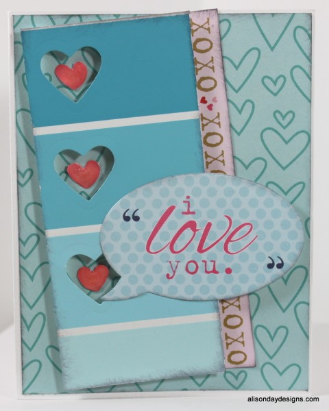
On a scrapbook layout, this can be achieved by our photos.

Placing them in a horizontal or vertical row creates rhythm by repetition. In this case, the repetition is also underneath the photos – more subtly – with three repeating red squares. The polka dot paper in the background is also an example of how to use repetition on your layouts – in your patterns.

Here the photos are in a vertical column but the wood grain paper in the background minimizes the vertical-ness (is that a word? I think for today, yes!) Instead of reading the photos as one vertical column, the wide stripes in the background mean that your eye will read the photos as three horizontal elements that repeat.
The use of buttons is a case of repeating a shape to create rhythm and their placement acts to move your eyes over to the title and journaling. Remembering that here in the west we read starting from the top left of a page, your eyes will initially take in that top photo and naturally look for another of that same repeated shape – the photo underneath it. Once your eyes reach the bottom of that column they look for where else to go and pick up on the large blue button to the left. Immediately we recognize that the button is repeated on the upper right so off your eyes go in that direction. Since they are already moving that way, they keep going up and to the right until they find the title and journaling underneath the last instance of the repeated round shape.
Alternation
This adds a layer of complexity to the design. Like repetition, alternation can still be quite structured and organized, but now we are purposefully using changes in the design elements to create the rhythm on the page (or in a room). Think pinstripes or the black and white alternation of a zebra’s skin. The buttons in the layout above, while being a repeating element that falls under the repetition category, are also different sizes. They in fact alternate from large to small.
Here are more examples of that.

Again I’ve used circles here. Large and small circles cut from my background patterned paper direct your around the page. This is not an example of structured and organized alternation to be sure, but that’s the point. While structure and organization are great, you can still achieve these concepts in a more free form manner.

This is a very busy layout at first glance but look more closely and you will recognize that I have used a basic grid pattern to create it. Grids are great examples of repetition so why am I using this when I’m trying to teach you about alternation? I have alternated large blocks with my smaller photos and used repeating shapes like hearts and circles, alternated across the grid, to help your eyes move in a logical manner around the page. These differences break up the structured grid pattern just enough to create the desired movement.

One last example before we move on and here I want to direct your eyes to two places on this layout. First is the row of brads beneath the left most photos. I have used alternation here as they go from small to big and back to small. The second is an instance of manufacturers using alternation on their products. It doesn’t have to be something as specific as pinstripes, it can be more subtle like the banner image printed on this journaling card from Elle’s Studio. The banner alternates from a full scalloped circle to a half scalloped circle.
Progression
Our last way of creating rhythm is through progression. This is a way of suggesting movement by drawing your eye in a directional sequence. It can be achieved through a series of light colours to dark colours, or of small objects to large objects. Also in the progression of patterns in some wallpaper designs.There are many patterned papers out there that have a sort of ‘wallpaper pattern’ look to them.
The ombre trend is a fantastic example of progression! Manufacturers make it easy for us to create movement on our pages without us even realizing we’re doing it! My first example is a home made ombre look.

The progression is achieved with gradually darkening papers as you go down. And in fact, because the colour progresses from light to dark from the top to the bottom, that is exactly how your eye moves over the card.
This card also reminds me of the Dear Lizzy papers with rows of tissue paper ruffles on them. Gorgeous and with graduated colour schemes!
Another example of colour progression but this time the light colour is on the bottom. Here is where our first lesson on balance also comes into play. Because the darker blue has a greater perceived visual weight than the lighter blue, I placed the sentiment element down with the lighter blue to add weight to the bottom of the card and restore the overall balance.

In this example I’ve not used a progression of size or colour to create the directional movement (although there is a tiny bit of that at play here too), I’ve used the photos themselves. They are arranged in a stepped pattern. A stair case if you will. This is a totally recognizable pattern to our eye and one we are perfectly happy to travel down! Starting at the top left (because that’s where we are trained to start “reading” the page), The first element we see is a large piece of patterned vellum and the first photo. Because the photo has more weight than the vellum, our eye will stay there longer and then look for another similar item to look at next. In this case, the photo below it which starts the downward and to the right movement. Once your eyes have taken in the three photos they are free to go back and look at the other elements. The progression of lighter pinks and oranges at the top to the darker pinks at the bottom, for example.
So you see, there are many ways to create movement and interest on your pages (and cards) using the principle of Rhythm.
To recap:
Rhythm can be thought of as organized movement or recurrence of patterns.
In Repetition elements or concepts are repeated in a structured and organized manner. This allows our eyes to move in an orderly fashion across the design.
In Alternation the elements of the page are alternately changed to create a more complex system of design. Small to big, thin to thick, black to white, are just some of the ways this can be achieved.
In Progression movement is suggested by the rhythmic advancement of colour, size, or pattern. Light colours to dark colours, and small objects to large objects for example.
Where do you go from here? Just as you did last week, take a look at your pages and see if you can first identify instances of Rhythm on them. Did you repeat shapes or colours to draw your viewers eyes to specific elements? Are you trying to create movement but no matter what you do, the layout feels static? Refer back to my examples and see if you can use any of those strategies on your own to help. Perhaps a row of repeated brads under your photo will help to draw the eye to the journaling beside it. Or maybe you need to order your photos into a line to better tell the story? If your photos are from the same event then this can do a lot to help create logical flow.
Next week will we talk about Emphasis and how it is a great tool to bring focus into your layouts. If you would like to read more about the Design Principle of Rhythm then you can check out this article by Debbie Hodge where she talks about Flow. Until then, have fun and go with the flow!
(See what I did there?)
 Follow
